Value does not have to be exclusive to fundamental analysis. We can also, create a value chart in technical analysis which acts as a reversal indicator.
Creating the Value Charts
Value charts were first introduced by Mark Helweg and David Stendahl in their 2002 book — Dynamic Trading Indicator. The main idea was to enhance the relative strength which has many limitations due to the fact that it is unbounded.
We typically use them in a different panel and treat them as indicators. We need two concepts to create the value chart:
Moving averages.
Extreme range.
Then, we calculate the extreme range which is the difference between the high and low of every time step. Next, we need to calculate the volatility unit which is simply a 5-period moving average of the last calculation multiplied by 1 / the selected period, in this case, it is 5.
You can also check out my other newsletter The Weekly Market Sentiment Report that sends tactical directional views every weekend to highlight the important trading opportunities using a mix between sentiment analysis (COT reports, Put-Call ratio, Gamma exposure index, etc.) and technical analysis.
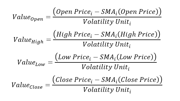
Finally, we use the below formula for the OHLC data to create the value chart.
// This source code is subject to the terms of the Mozilla Public License 2.0 at https://mozilla.org/MPL/2.0/
// © Sofien-Kaabar

//@version=5
indicator("Value Chart", overlay = false)

lookback = input(defval = 13, title = 'Lookback')

open_ma  = ta.sma(open, lookback)
high_ma  = ta.sma(high, lookback)
low_ma   = ta.sma(low, lookback)
close_ma = ta.sma(close, lookback)

extreme_range = high - low

volatility_unit = ta.sma(extreme_range, 5) / 5

open_price = (open - open_ma) / volatility_unit
high_price = (high - high_ma) / volatility_unit
low_price = (low - low_ma) / volatility_unit
close_price = (close - close_ma) / volatility_unit

palette = close_price > open_price ? color.rgb(117, 193, 255) : color.rgb(255, 118, 118)

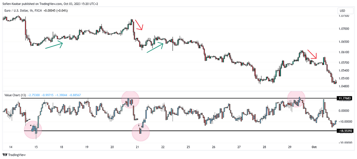
plotcandle(open_price, high_price, low_price, close_price, color = palette)We generally watch for subjective barriers for reversal moves.
Using the Value Charts
Value charts are used the same way as other contrarian indicators such as the RSI even though the name of barriers differ as with value charts, we tend to say overvalued/undervalued and with other indicators, we tend to say oversold/overbought.
You can also draw trend lines on the value chart like the following:
You can also check out my other newsletter The Weekly Market Analysis Report that sends tactical directional views every weekend to highlight the important trading opportunities using technical analysis that stem from modern indicators. The newsletter is free.
If you liked this article, do not hesitate to like and comment, to further the discussion!


