Value Charts — Another Way to Trade the Markets.
Creating Value Charts in Python.


Value does not have to be exclusive to fundamental analysis. We can also, create a value chart in technical analysis which acts as a reversal indicator.
I have just released a new book after the success of my previous one “The Book of Trading Strategies”. It features advanced trend-following indicators and strategies with a GitHub page dedicated to the continuously updated code. Also, this book features the original colors after having optimized for printing costs. If you feel that this interests you, feel free to visit the below Amazon link, or if you prefer to buy the PDF version, you could contact me on LinkedIn.
Creating the Value Charts
Value charts were first introduced by Mark Helweg and David Stendahl in their 2002 book — Dynamic Trading Indicator. The main idea was to enhance the relative strength which has many limitations due to the fact that it is unbounded.
We typically use them in a different panel and treat them as indicators. We need two concepts to create the value chart:
Moving averages.
Extreme range.
We first start by calculating the moving average of the open, high, low, and close columns. We can use a 20-period moving average but this is totally up to you and to the analyzed underlying.
def adder(Data, times):

    for i in range(1, times + 1):

        new = np.zeros((len(Data), 1), dtype = float)
        Data = np.append(Data, new, axis = 1)
return Datadef deleter(Data, index, times):
for i in range(1, times + 1):
Data = np.delete(Data, index, axis = 1) return Data
def jump(Data, jump):
Data = Data[jump:, ]
return Datadef ma(Data, lookback, close, where):
# Adding a column
Data = adder(Data, 1)
for i in range(len(Data)):
try:
Data[i, where] = (Data[i - lookback + 1:i + 1, close].mean())
except IndexError:
pass
# Cleaning
Data = jump(Data, lookback)
return DataThen, we calculate the extreme range which is the difference between the high and low of every time step. Next, we need to calculate the volatility unit which is simply a 5-period moving average of the last calculation multiplied by 1 / the selected period, in this case, it is 5.
Finally, we use the below formula for the OHLC data to create the value chart.

This gives us the following chart.

We generally watch for subjective barriers for reversal moves. They mainly depend on the market, therefore,
def value_chart(data, lookback_ma, lookback_vol, open_price, high_price, low_price, close_price, where):

    # calculating the moving average
    data = ma(data, lookback_ma, open_price, where)
    data = ma(data, lookback_ma, high_price, where  + 1)
    data = ma(data, lookback_ma, low_price, where   + 2)
    data = ma(data, lookback_ma, close_price, where + 3)

    # calculating the volatility unit
    data = adder(data, 5)
    data[:, where + 4] = data[:, high_price] - data[:, low_price]
    data = ma(data, lookback_vol, where + 4, where + 5)
    data[:, where + 5] = data[:, where + 5] * (1 / lookback_vol)

    # calculating the value chart
    for i in range(len(data)):

        data[i, where + 6] = (data[i, open_price] - data[i, where]) / data[i, where + 5]
        data[i, where + 7] = (data[i, high_price] - data[i, where + 1]) / data[i, where + 5]
        data[i, where + 8] = (data[i, low_price] - data[i, where + 2]) / data[i, where + 5]
        data[i, where + 9] = (data[i, close_price] - data[i, where + 3]) / data[i, where + 5]

    # cleaning
    data = deleter(data, where, 6)

    return data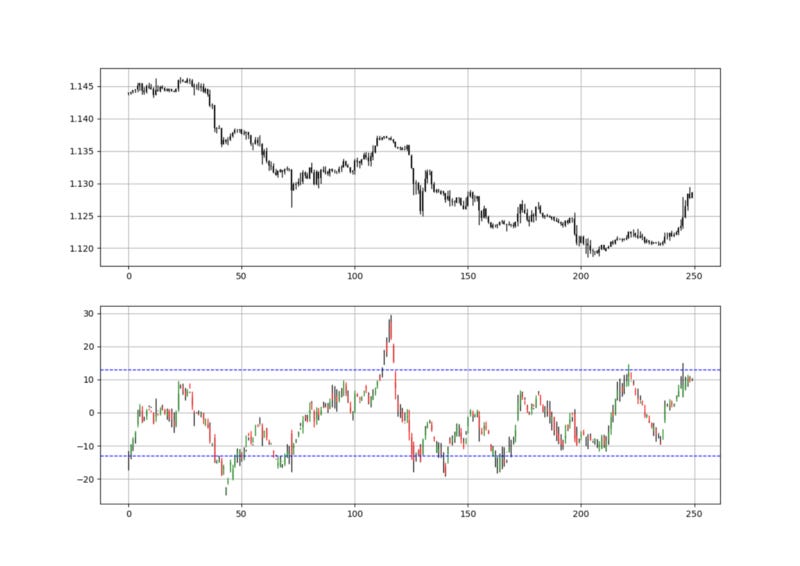
def indicator_plot_value(data, window = 250): fig, ax = plt.subplots(2, figsize = (10, 5)) chosen = data[-window:, ]
for i in range(len(chosen)):
ax[0].vlines(x = i, ymin = chosen[i, 2], ymax = chosen[i, 1], color = 'black', linewidth = 1)
if chosen[i, 3] > chosen[i, 0]: ax[0].vlines(x = i, ymin = chosen[i, 0], ymax = chosen[i, 3], color = 'black', linewidth = 1.5) if chosen[i, 3] < chosen[i, 0]:
ax[0].vlines(x = i, ymin = chosen[i, 3], ymax = chosen[i, 0], color = 'black', linewidth = 1.5)
if chosen[i, 3] == chosen[i, 0]:
ax[0].vlines(x = i, ymin = chosen[i, 3], ymax = chosen[i, 0], color = 'black', linewidth = 1.5)
ax[0].grid()
for i in range(len(chosen)):
ax[1].vlines(x = i, ymin = chosen[i, 6], ymax = chosen[i, 5], color = 'black', linewidth = 1)
if chosen[i, 7] > chosen[i, 4]: ax[1].vlines(x = i, ymin = chosen[i, 4], ymax = chosen[i, 7], color = 'green', linewidth = 1) if chosen[i, 7] < chosen[i, 4]:
ax[1].vlines(x = i, ymin = chosen[i, 7], ymax = chosen[i, 4], color = 'red', linewidth = 1)
if chosen[i, 7] == chosen[i, 4]:
ax[1].vlines(x = i, ymin = chosen[i, 7], ymax = chosen[i, 4], color = 'black', linewidth = 1) ax[1].axhline(y = -13, color = 'blue', linestyle = 'dashed', linewidth = 1)
ax[1].axhline(y = 13, color = 'blue', linestyle = 'dashed', linewidth = 1) ax[1].grid()Using the Value Charts
Value charts are used the same way as other contrarian indicators such as the RSI even though the name of barriers differ as with value charts, we tend to say overvalued/undervalued and with other indicators, we tend to say oversold/overbought.
The strategy is quite simple but very modifiable. For a value chart(20, 5):
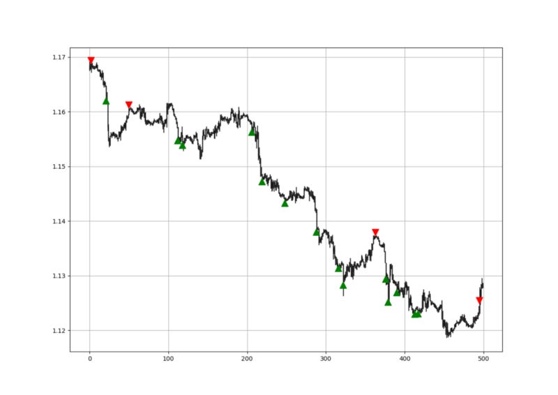
A long (Buy) signal is generated whenever the indicator hits -13.
A short (Sell) signal is generated whenever the indicator hits 13.
def signal(data, high_value, low_value, buy_column, sell_column):

    data = adder(data, 2)

    for i in range(len(data)):

        if data[i, low_value] < -13 and data[i - 1, low_value] > -13:

            data[i, buy_column] = 1

        if data[i, high_value] > 13 and data[i - 1, high_value] < 13:

            data[i, sell_column] = -1

    return data
Of course, extensive back-testing must be done to prove that value charts do add ‘value’ to our trading.
If you are also interested by more technical indicators and strategies, then my book might interest you:
Conclusion
Remember to always do your back-tests. You should always believe that other people are wrong. My indicators and style of trading may work for me but maybe not for you.
I am a firm believer of not spoon-feeding. I have learnt by doing and not by copying. You should get the idea, the function, the intuition, the conditions of the strategy, and then elaborate (an even better) one yourself so that you back-test and improve it before deciding to take it live or to eliminate it. My choice of not providing specific Back-testing results should lead the reader to explore more herself the strategy and work on it more.
To sum up, are the strategies I provide realistic? Yes, but only by optimizing the environment (robust algorithm, low costs, honest broker, proper risk management, and order management). Are the strategies provided only for the sole use of trading? No, it is to stimulate brainstorming and getting more trading ideas as we are all sick of hearing about an oversold RSI as a reason to go short or a resistance being surpassed as a reason to go long. I am trying to introduce a new field called Objective Technical Analysis where we use hard data to judge our techniques rather than rely on outdated classical methods.
One Last Word
I have recently started an NFT collection that aims to support different humanitarian and medical causes. The Society of Light is a set of limited collectibles which will help make the world slightly better as each sale will see a percentage of it sent directly to the charity attributed to the avatar. As I always say, nothing better than a bullet list to outline the benefits of buying these NFT’s:
High-potential gain: By concentrating the remaining sales proceedings on marketing and promoting The Society of Light, I am aiming to maximize their value as much as possible in the secondary market. Remember that trading in the secondary market also means that a portion of royalties will be donated to the same charity.
Art collection and portfolio diversification: Having a collection of avatars that symbolize good deeds is truly satisfying. Investing does not need to only have selfish needs even though there is nothing wrong with investing to make money. But what about investing to make money, help others, and collect art?
Donating to your preferred cause(s): This is a flexible way of allocating different funds to your charities.
A free copy of my book in PDF: Any buyer of any NFT will receive a free copy of my latest book shown in the link of the article.