
Use This Complex Technical Indicator
Coding and Using the Squeeze Indicator in PineScript 6

The Squeeze indicator is a volatility-momentum technical oscillator created by John Carter to measure and trade breakouts. It uses multiple indicators fused together to deliver the buy or sell signals. In this article, we will create the indicator from scratch and create the signals in Python. but first, we discuss the main ingredients that will lead us to the Squeeze indicator.
Bollinger Bands
One of the pillars of descriptive statistics or any basic analysis method is the concept of averages. Averages give us a glance of the next expected value given a historical trend. They can also be a representative number of a larger dataset that helps us understand the data quickly. Another pillar is the concept of volatility. Volatility is the average deviation of the values from their mean. Let us create the simple hypothetical table with different random variables.

Let us suppose that the above is a timely ordered time series. If we had to naively guess the next value that comes after 10, then one of the best guesses can be the average the data. Therefore, if we sum up the values {5, 10, 15, 5, 10} and divide them by their quantity (i.e. 5), we get 9. This is the average of the above dataset.
Now that we have calculated the mean value, we can see that no value in the dataset really equals 9. How do we know that the dataset is generally not close to the dataset? This is measured by what we call the standard deviation.
The standard deviation simply measures the average distance away from the mean by looping through the individual values and comparing their distance to the mean.
The standard deviation of the dataset is around 3.74. This means that on average, the individual values are 3.74 units away from 9 (the mean). Now, let us move on to the normal distribution shown in the below curve.

The above curve shows the number of values within a number of standard deviations. For example, the area shaded in red represents around 1.33x of standard deviations away from the mean of zero. We know that if data is normally distributed then:
About 68% of the data falls within 1 standard deviation of the mean.
About 95% of the data falls within 2 standard deviations of the mean.
About 99% of the data falls within 3 standard deviations of the mean.
Presumably, this can be used to approximate the way to use financial returns data, but studies show that financial data is not normally distributed but at the moment we can assume it is so that we can use such indicators. The flawness of the method does not hinder much its usefulness.
Now, with the information below, we are ready to start creating the Bollinger bands indicator:
Financial time series data can have a moving average that calculates a rolling mean window. For example a 20-period moving average calculates each time a 20-period mean that refreshes each time a new bar is formed.
On this rolling mean window, we can calculate the standard deviation of the same lookback period on the moving average.
What are the Bollinger bands? When prices move, we can calculate a moving average (mean) around them so that we better understand their position regarding their mean. By doing this, we can also calculate where do they stand statistically.
Some say that the concept of volatility is the most important one in the financial markets industry. Trading the volatility bands is using some statistical properties to aid you in the decision making process, hence, you know you are in good hands.
The idea of the Bollinger bands is to form two barriers calculated from a constant multiplied by the rolling standard deviation. They are in essence barriers that give out a probability that the market price should be contained within them. The lower Bollinger band can be considered as a dynamic support while the upper Bollinger band can be considered as a dynamic resistance. Hence, the Bollinger bands are simple a combination of a moving average that follows prices and a moving standard deviation(s) band that moves alongside the price and the moving average.
To calculate the two Bands, we use the following relatively simple formulas:

With the constant being the number of standard deviations that we choose to envelop prices with. By default, the indicator calculates a 20-period simple moving average and two standard deviations away from the price, then plots them together to get a better understanding of any statistical extremes.
This means that on any time, we can calculate the mean and standard deviations of the last 20 observations we have and then multiply the standard deviation by the constant. Finally, we can add and subtract it from the mean to find the upper and lower band.
Clearly, the below chart seems easy to understand. Every time the price reaches one of the bands, a contrarian position is most suited and this is evidenced by the reactions we tend to see when prices hit these extremes. So, whenever the EURUSD reaches the upper band, we can say that statistically, it should consolidate and when it reaches the lower band, we can say that statistically, it should bounce.

Keltner Channel
The Keltner channel is a volatility-based technical indicator that resembles the Bollinger bands, only it uses an exponential moving average as the mean calculation and the average true range (ATR) as a volatility proxy. Hence, here is the main two differences between the two:
The Bollinger bands: A simple moving average with bands based on historical standard deviation.
The Keltner channel: An exponential moving average with bands based on the ATR.
But what is the ATR? Although it is considered as a lagging indicator, it gives some insights as to where volatility is now and where has it been last period (day, week, month, etc.).
Check out my newsletter that sends weekly directional views every weekend to highlight the important trading opportunities using a mix between sentiment analysis (COT report, put-call ratio, etc.) and rules-based technical analysis.

First, we should understand how the true range is calculated (the ATR is just the average of that calculation). Consider an OHLC data composed of an timely arrange open, high, low, and close prices. For each time period (bar), the true range is simply the greatest of the three price differences:
High - Low
High - Previous close
Previous close - Low
Once we have got the maximum out of the above three, we simply take a smoothed average of n periods of the true ranges to get the ATR.
Now, we calculate the Keltner channel using an exponential moving average with the ATR of the price. Here is the formula:


The Squeeze Indicator
After discussing the above three indicators, we are now set to create the Squeeze indicator. Simply put, the main goal of the indicator is to initiate a position when the squeeze becomes OFF after being ON for a specified time. What do we mean by ON and OFF? Basically:
Whenever the upper Bollinger band is lower than the upper Keltner Channel while the lower Bollinger band is greater than the lower Keltner Channel, the squeeze is ON.
Whenever any of the above conditions are not true, the squeeze is OFF.
Therefore, we understand that the Squeeze indicator will be a combination of the following:
A 20-period Bollinger bands with 2.00 standard deviation.
A 20-period Keltner channel with 1.50 ATR multiplier.
// This Pine Script™ code is subject to the terms of the Mozilla Public License 2.0 at https://mozilla.org/MPL/2.0/
// © Sofien-Kaabar

//@version=6
indicator("Squeeze Indicator", overlay=false)

// Input parameters
lengthBB = input.int(20, title="Bollinger Bands Length")
lengthKC = input.int(20, title="Keltner Channels Length")
multBB = input.float(2.0, title="Bollinger Bands Multiplier")
multKC = input.float(1.5, title="Keltner Channels Multiplier")

// Bollinger Bands calculation
basisBB = ta.sma(close, lengthBB)
devBB = multBB * ta.stdev(close, lengthBB)
upperBB = basisBB + devBB
lowerBB = basisBB - devBB

// Keltner Channels calculation
basisKC = ta.sma(close, lengthKC)
rangeKC = multKC * ta.atr(lengthKC)
upperKC = basisKC + rangeKC
lowerKC = basisKC - rangeKC

// Squeeze condition
squeezeOn = upperBB < upperKC and lowerBB > lowerKC
squeezeOff = not squeezeOn

// Momentum calculation
momentum = close - close[1]

// Plot squeeze dots
plotshape(squeezeOn, style=shape.circle, location=location.bottom, color=color.red, size=size.small, title="Squeeze On")
plotshape(squeezeOff, style=shape.circle, location=location.bottom, color=color.green, size=size.small, title="Squeeze Off")

// Plot momentum histogram
plot(momentum, color=momentum > 0 ? color.green : color.red, title="Momentum")
hline(0, color=color.black)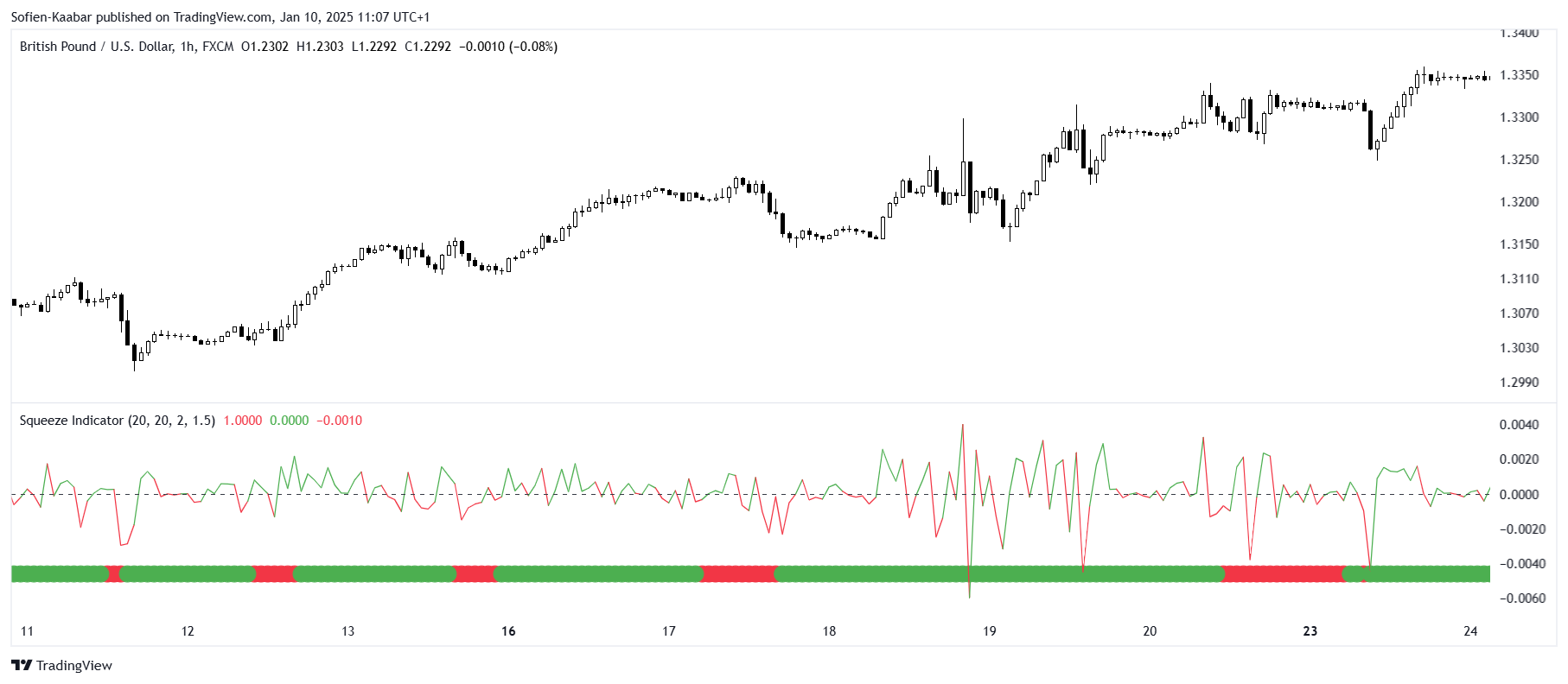
The above shows the values of the GBPUSD with the Squeeze indicator composed of a line fluctuates around a zero value. We can notice a straight line in green and sometimes in red, this denotes when the squeeze is ON and when is it OFF, thus helping us visualize the squeeze. From all the above, we will have the below trading rules:
A bullish signal is generated whenever the squeeze line turns green (after having been red) while simultaneously the line above zero.
A bearish signal is generated whenever the squeeze line turns green (after having been red) while simultaneously the line is below zero.
The indicator can be tweaked as desired but is unlikely to produce a significantly different return from other mainstream indicators. This is to say that it can offer a diversification factor but does it provide a full profitable strategy? That is something that needs more research.
Conclusion
Remember to always do your back-tests. You should always believe that other people are wrong. My indicators and style of trading may work for me but maybe not for you.
I am a firm believer of not spoon-feeding. I have learnt by doing and not by copying. You should get the idea, the function, the intuition, the conditions of the strategy, and then elaborate (an even better) one yourself so that you back-test and improve it before deciding to take it live or to eliminate it.