Try This Very Powerful Market Reversal Indicator
Using K’s Reversal Indicator I to Detect Powerful Reversals
This article discusses a promising indicator based on two famous classic indicators.
Components of the Indicator
K’s Reversal Indicator I is composed of two famous technical indicators, Bollinger bands and the MACD. Let’s refresh our knowledge of both.
Bollinger bands are a technical analysis tool developed by John Bollinger in the 1980s. They are used to analyze the volatility and potential price reversals in financial markets, most commonly in stocks, but they can be applied to other assets as well. Bollinger Bands consist of three lines plotted on a price chart. The middle band is a simple moving average (SMA) of the asset’s price over a specified period, typically 20 days. The upper and lower bands are calculated by adding and subtracting a multiple of the standard deviation of the price from the middle band.
The standard settings for Bollinger Bands use a multiplier of 2, meaning the upper and lower bands are positioned two standard deviations away from the moving average. However, traders can adjust the settings based on their preferences and the characteristics of the asset they are analyzing.
The main interpretation of Bollinger Bands revolves around the concept that prices tend to stay within the bands most of the time. When prices touch or move close to the upper band, it suggests that the asset is overbought, and a potential price reversal or corrective move may occur. Conversely, when prices touch or move close to the lower band, it indicates that the asset is oversold, and a potential price reversal to the upside may occur.
MACD stands for moving average convergence divergence. It is a popular technical analysis indicator used to identify potential trend reversals, generate buy and sell signals, and measure the strength of a price movement. Gerald Appel developed MACD in the late 1970s. MACD consists of two main components:
1. MACD line: The MACD line is calculated by subtracting the longer-term exponential moving average (EMA) from the shorter-term EMA. The most common settings for the MACD line are 12-day EMA minus the 26-day EMA. The MACD line oscillates above and below a zero line, providing insights into the relationship between the two EMAs and the momentum of the price movement.
2. Signal line: The signal line is a moving average (typically a 9-day EMA) of the MACD line. It helps to smooth out the MACD line and generate trading signals. When the MACD line crosses above the signal line, it generates a bullish signal, indicating a potential buying opportunity. Conversely, when the MACD line crosses below the signal line, it generates a bearish signal, indicating a potential selling opportunity.
Additionally, the MACD histogram is often plotted below the MACD line and signal line. It represents the difference between the MACD line and the signal line. The histogram helps traders visualize the strength and momentum of the price movement. Positive values indicate bullish momentum, while negative values indicate bearish momentum.
As with any technical analysis tool, it’s important to use MACD in conjunction with other analysis techniques and risk management strategies for effective decision-making.
Visualizing the Indicator
Detecting market tops and bottoms is no perfect science and will never be. All we have are estimations of an outstretched move that is likely over and based on those estimations, we have a probability of being right or wrong. Our aim is to maximize the probability of being right while being dynamic to changes in the market.
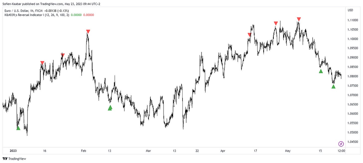
This is easier said than done. K’s Reversal Indicator I tries to combine both indicators into one powerful signal generator using the following rules:
For a buy signal to be generated, we need a market price at or below the lower 100-period Bollinger band with a MACD that has just crossed over its signal line.
For a sell signal to be generated, we need a market price at or above the upper 100-period Bollinger band with a MACD that has just crossed under its signal line.
The following Figure shows a few signals generated by K’s Reversal Indicator I:
You can find the indicator on TradingView here. The following Figure shows a few signals generated by K’s Reversal Indicator I:
As is the case with every indicator, there are periods where the momentum is just too strong for any reversal technique to work. This can be seen in the signals within the yellow box:
You can also check out my other newsletter The Weekly Market Sentiment Report that sends weekly directional views every weekend to highlight the important trading opportunities using a mix between sentiment analysis (COT report, put-call ratio, etc.) and rules-based technical analysis.
If you liked this article, do not hesitate to like and comment, to further the discussion!


