Tomorrow’s Numbers Today — Accurately Forecasting The S&P 500
Creating a Machine Learning Model to Forecast Daily Equity Returns
Equity return forecasting is a critical aspect of investment and financial analysis. Investors and traders often seek ways to predict how the prices of stocks, bonds, or other equity assets will behave in the future. Machine learning has emerged as a valuable tool in this context, enabling the development of predictive models that can analyze historical data and make informed forecasts about equity returns.
This article will use two exogenous time series related to equity markets as inputs to forecast the returns of the S&P 500.
Understanding the Inputs
The research will be to use two publicly available indicators as inputs in a regression task which aims to predict the changes in the S&P 500.
The dark index (DIX) provides a way of peeking into the secret (dark) exchanges. it is calculated as an aggregate value of many dark pool indicators and measures the hidden market sentiment. When the values of this indicator are higher than usual, it means that more buying occurred in dark pools than usual. We can profit from this informational gap. It is therefore a trail of liquidity providers (i.e. negatively correlated with the market it follows due to hedging activities).
The gamma exposure index (GEX) relates to the sensitivity of option contracts to changes in the underlying price. When imbalances occur, the effects of market makers’ hedges may cause price swings (such as short squeezes). The absolute value of the GEX index is simply the number of shares that will be bought or sold to push the price in the opposite direction of the trend when a 1% absolute move occurs. For example, if the price moves +1% with the GEX at 5.0 million, then, 5.0 million shares will come pouring in to push the market to the downside as a hedge.
The previous two indicators will try to forecast the returns of the S&P 500 index. The S&P 500 is a stock market index that is widely regarded as one of the most important and representative indices of the U.S. stock market. The S&P 500 index is used to gauge the performance of the largest and most influential publicly traded companies in the United States.
The following chart shows the three time series.
You can also check out my other newsletter The Weekly Market Sentiment Report that sends tactical directional views every weekend to highlight the important trading opportunities using a mix between sentiment analysis (COT reports, Put-Call ratio, Gamma exposure index, etc.) and technical analysis.
Creating the Algorithm
The plan of attack for the algorithm is as follows:
Import the data to Python, preprocess it (by differencing it), and splitting it into training and test sets.
Fit the model using a random forest algorithm and predict the values.
Evaluate the results.
Use the following code to implement the algorithm (make sure to pip install selenium and to download Chrome Webdriver):
# Importing Libraries
import pandas as pd
import numpy  as np
from selenium import webdriver
from selenium.webdriver.common.by import By
from sklearn.ensemble import RandomForestRegressor
import matplotlib.pyplot as plt

# Calling Chrome
driver = webdriver.Chrome()

# URL of the Website from Where to Download the Data
url = "https://squeezemetrics.com/monitor/dix"

# Opening the website
driver.get(url)

# Getting the button by ID
button = driver.find_element(By.ID, "fileRequest")

# Clicking on the button
button.click()

import time

# Sleep for 5 seconds
time.sleep(5)

# Importing the Excel File Using pandas
my_data = pd.read_csv('DIX.csv')

# Transforming the File to an Array
selected_columns = ['price', 'dix', 'gex']
my_data = my_data[selected_columns]
my_data['gex'] = my_data['gex'].shift(34) # After optimization
my_data['dix'] = my_data['dix'].shift(60) # After optimization

my_data = my_data.dropna()
my_data = np.array(my_data)

'''
# Create a figure with three subplots
fig, (ax1, ax2, ax3) = plt.subplots(3, 1)

# Plot data on each subplot
ax1.plot(my_data[-1000:, 0], label = 'S&P 500', color = 'red')
ax1.legend()
ax1.grid()

ax2.plot(my_data[-1000:, 1], label = 'DIX', color = 'black')
ax2.legend()
ax2.grid()

ax3.plot(my_data[-1000:, 2], label = 'GEX')
ax3.legend()
ax3.grid()
'''

my_data = pd.DataFrame(my_data)
my_data = my_data.diff()
my_data = my_data.dropna()
my_data = np.array(my_data)

def data_preprocessing(data, train_test_split):

    # Split the data into training and testing sets
    split_index = int(train_test_split * len(data))
    x_train = data[:split_index, 1:]
    y_train = data[:split_index, 0]
    x_test = data[split_index:, 1:]
    y_test = data[split_index:, 0]

    return x_train, y_train, x_test, y_test

x_train, y_train, x_test, y_test = data_preprocessing(my_data, 0.87)

model = RandomForestRegressor(max_depth = 200, random_state = 0)

model.fit(x_train, y_train)
y_pred = model.predict(x_test)

same_sign_count = np.sum(np.sign(y_pred) == np.sign(y_test)) / len(y_test) * 100
print('Hit Ratio = ', same_sign_count, '%')

plt.plot(y_pred[-100:], label='Predicted Data', linestyle='--', marker = '.', color = 'blue')
plt.plot(y_test[-100:], label='True Data', marker = '.', alpha = 0.7, color = 'red')
plt.legend()
plt.grid()
plt.axhline(y = 0, color = 'black', linestyle = '--')
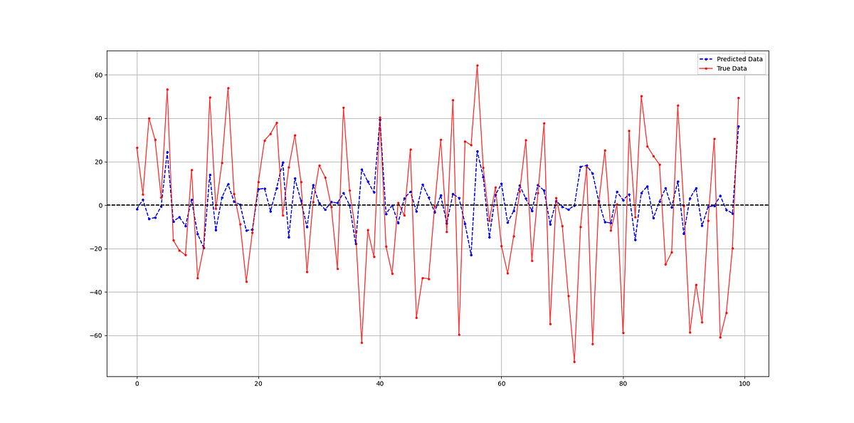
The following chart shows a comparison between predicted and real data.
The hit ratio of the model is as follows:
Hit Ratio = 57.71 %When experimenting, I have come to know that it can be increased significantly. It seems that both indicators are valid candidates to help understand the variations of the S&P 500 index.
You can also check out my other newsletter The Weekly Market Analysis Report that sends tactical directional views every weekend to highlight the important trading opportunities using technical analysis that stem from modern indicators. The newsletter is free.
If you liked this article, do not hesitate to like and comment, to further the discussion!


