The Quick Handbook of Candlestick Patterns
A Mini Encyclopedia of the Key Candlestick Patterns to Leverage Your Trading
Candlestick patterns form an important pattern recognition tool in the field of technical analysis. This article presents a selection of a few classic and modern candlestick patterns that can be used to leverage your trading.
What Are Candlestick Patterns?
Candlestick patterns are a type of technical analysis tool used by traders and analysts to interpret price movements in financial markets. These patterns are formed by the arrangement of individual candlesticks on a price chart over a specific time period, such as minutes, hours, days, or weeks.
Each candlestick represents a specific time frame and provides information about the opening, closing, high, and low prices of an asset within that time period. Candlestick patterns help traders identify potential trend reversals, continuation patterns, and market sentiment. They are particularly popular in Japanese candlestick charting, which originated in Japan and is widely used in technical analysis today.
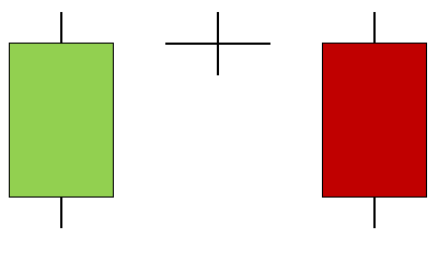
A green candlestick is bullish and it occurs when the close price is higher than the open price.
A red candlestick is bearish and it occurs when the close price is lower than the open price.
The following Figure shows a candlestick chart on daily EURUSD observations:
Classic Patterns — The Doji Pattern
Classic candlestick patterns are the ones taught to us in every introductory technical analysis course. They form the basis and the first ones that paved the way for more complex patterns (that you will see in this article).
The Doji pattern is a one-candlestick contrarian configuration but we generally observe what happens before it and one candlestick after it so that we confirm the type of the Doji. The Doji’s general shape is a candlestick that resembles a plus sign which simply means that the close price equals the open price.
The bullish Doji is composed of a plus sign candlestick that has the open price equal to the close price. It should be followed by a confirmation bullish candlestick and preceded by a bearish candlestick. The following Figure shows a theoretical illustration of the bullish Doji.
The bearish Doji is composed of a plus sign candlestick that has the open price equal to the close price. It should be followed by a confirmation bearish candlestick and preceded by a bullish candlestick. The following Figure shows a theoretical illustration of the bearish Doji.
The following Figure shows an example(s) of the pattern applied on a chart. Note that green arrows represent a bullish pattern and an expected bullish outlook afterwards while red arrows represent a bearish pattern and an expected bearish outlook afterwards.
Classic Patterns — The Engulfing Pattern
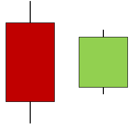
The Engulfing pattern is a two-candlestick contrarian configuration. The Engulfing’s general shape is a candlestick that fully englobes the previous one within its high and low prices.
The bullish Engulfing is composed of a bullish candlestick with a high price higher than the previous high price and a low price lower than the previous low price of the previous candlestick. The previous candlestick has to be bearish. The following Figure shows a theoretical illustration of the bullish Engulfing.
The bearish Engulfing is composed of a bearish candlestick with a high price higher than the previous high price and a low price lower than the previous low price of the previous candlestick. The previous candlestick has to be bullish. The following Figure shows a theoretical illustration of the bearish Engulfing.
The following Figure shows an example(s) of the pattern applied on a chart:
If you want to see more of my work, you can visit my website for the books catalogue by simply following this link:
Classic Patterns — The Harami Pattern
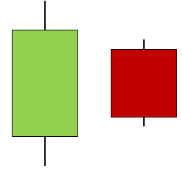
The Harami pattern is a two-candlestick contrarian configuration. It can be segmented into two types, the strict Harami and the flexible Harami. We will discuss both. The Harami’s general shape is a candlestick that fully englobes the candlestick that follows it.
The strict bullish Harami is composed of a bullish candlestick with the high price lower than the open price of the previous candlestick and the low price higher than the close price of the previous candlestick. The following Figure shows a theoretical illustration of the strict bullish Harami.
The strict bearish Harami is composed of a bearish candlestick with the high price lower than the close price of the previous candlestick and the low price higher than the open price of the previous candlestick. The following Figure shows a theoretical illustration of the strict bearish Harami.
The flexible Harami pattern relaxes the condition that deals with the highs and lows.
The flexible bullish Harami is composed of a bullish candlestick with the high price lower than the high price of the previous candlestick and the low price higher than the low price of the previous candlestick. The following Figure shows a theoretical illustration of the flexible bullish Harami.
The flexible bearish Harami is composed of a bearish candlestick with the high price lower than the high price of the previous candlestick and the low price higher than the low price of the previous candlestick. The following Figure shows a theoretical illustration of the flexible bearish Harami.
The following Figure shows an example(s) of the pattern applied on a chart:
Classic Patterns — The Master Candle Pattern
The Master Candle pattern is composed of seven candlesticks where the first one englobes the next five candlesticks before the last one exits either from the upside or the downside.
The following Figure shows a theoretical illustration of a bullish Master Candle pattern.
The following Figure shows a theoretical illustration of a bearish Master Candle pattern.
The following Figure shows an example(s) of the pattern applied on a chart:
Modern Patterns — The Golden Pattern
Modern candlestick patterns are candlesticks found through my personal research. I have found that there are many other patterns than the classic ones, and therefore it is always interesting to discuss them.
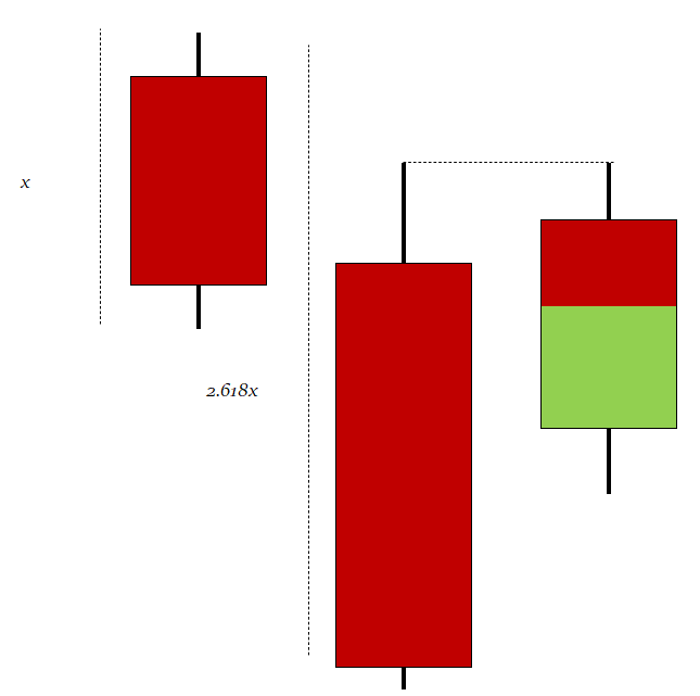
The Golden pattern is a three-candlestick configuration based on the golden ratio from the Fibonacci sequence. The golden ratio is 1.618 and variations of it include 0.618, 2.618, and 3.618. In this pattern, we are interested in 2.618 which seems to capture better reactions.
The bullish Golden pattern is composed of a normal bullish candlestick with any type of body, followed by a bigger bullish candlestick with a close price that is at least 2.618 times the size of the first candlestick (high to low). Finally, there must be an important condition that is a third candlestick that comes back to test the open of the second candlestick from where the entry is given. The following Figure shows a theoretical illustration of a bullish Golden pattern.
The bearish Golden pattern is composed of a normal bearish candlestick with any type of body, followed by a bigger bearish candlestick with a close price that is at least 2.618 times the size of the first candlestick (high to low). Finally, there must be an important condition that is a third candlestick that comes back to test the open of the second candlestick from where the entry is given. The following Figure shows a theoretical illustration of a bearish Golden pattern.
The following Figure shows an example(s) of the pattern applied on a chart:
Modern Patterns — The Shrinking Pattern
The Shrinking pattern is a reversal candlestick configuration which takes into account the shrinking candlesticks as a signal of exhaustion.
The bullish Shrinking is composed of five candlesticks with the first one being bearish followed by three shrinking candlesticks and a bullish candlestick that closes above the three previous highs. Additionally, the lows of the Shrinking candlesticks must be the same. The following Figure shows a theoretical illustration of a bullish Shrinking.
The bearish Shrinking is composed of five candlesticks with the first one being bullish followed by three shrinking candlesticks and a bearish candlestick that closes below the three previous lows. Additionally, the highs of the Shrinking candlesticks must be the same. The following Figure shows a theoretical illustration of a bearish Shrinking.
The following Figure shows an example(s) of the pattern applied on a chart:
Modern Patterns — The Volatility-Based Gap Pattern
When the opening price of a financial instrument differs significantly from the closing price of the previous day without any trading activity taking place in between, it is referred to as a gap. A gap or empty space is created as a result on the price chart.
Gaps can happen for a number of reasons, including:
News or announcements that have an impact on the market, which could result in a pause in trading when it resumes.
Market sentiment which may bring a sudden change in market attitude, such as panic selling or purchasing.
Technical elements such as stop-loss orders and limit orders.
Because they might reveal information about the market’s strength and direction, gaps are crucial for traders. After an upswing or downtrend, there may be a gap that indicates the trend will continue. On the other hand, a gap that develops following a time of consolidation can forecast a future reversal. The main hypothesis is that the gaps found signal reversals (for simplicity).
The bullish Volatility-Based Gap occurs whenever the open price is lower than the previous close price by at least the value shown in the previous 3-period ATR. The following Figure shows a theoretical illustration of the bullish Volatility-Based Gap.
The bearish Volatility-Based Gap occurs whenever the open price is higher than the previous close price by at least the value shown in the previous 3-period ATR. The following Figure shows a theoretical illustration of the bearish Volatility-Based Gap.
The following Figure shows an example(s) of the pattern applied on a chart:
You can also check out my other newsletter The Weekly Market Sentiment Report that sends weekly directional views every weekend to highlight the important trading opportunities using a mix between sentiment analysis (COT report, put-call ratio, etc.) and rules-based technical analysis.
If you liked this article, do not hesitate to like and comment, to further the discussion!


