


Candlestick charting does not have to be limited to price data. What if it can be used on technical indicators so that start testing some new pattern recognition techniques? In this article, the RSI is looked at from the perspective of a simple candlestick chart where trading signals are derived. The basic idea is to start thinking about finding a robust strategy that uses the technique of applying candlesticks to technical indicators in order to find either hidden patterns or trend reversal confirmation signals.
Knowledge must be accessible to everyone. This is why, from now on, a purchase of either one of my new books “Contrarian Trading Strategies in Python” or “Trend Following Strategies in Python” comes with free PDF copies of my first three books (Therefore, purchasing one of the new books gets you 4 books in total). The two new books listed above feature a lot of advanced indicators and strategies with a GitHub page. You can use the below link to purchase one of the two books (Please specify which one and make sure to include your e-mail in the note).
Pay Kaabar using PayPal.Me
Go to paypal.me/sofienkaabar and type in the amount. Since it’s PayPal, it’s easy and secure. Don’t have a PayPal…www.paypal.com
The Relative Strength Index
The RSI is without a doubt the most famous momentum indicator out there, and this is to be expected as it has many strengths especially in ranging markets. It is also bounded between 0 and 100 which makes it easier to interpret. The RSI is notably used in many ways, among them:
The extremes strategy: Where we search for overbought an oversold levels to initiate contrarian trades. The idea is that an overbought market has a high reading on the RSI signifying too much bullish momentum and a possible correction or even a reversal may take place. Similarly, an oversold market has a low reading on the RSI signifying too much bearish momentum and a possible correction or even a reversal may take place.
The divergence strategy: When there is an established trend, the overall direction does not move linearly with regards to magnitude and force, meaning that when a market is rising, its momentum strength is not stable. At the begining it is usually strong but by profit taking and lower convictions, the market starts to lose some strength, thus, continuing to rise but struggling to do so. This is where we see a bearish divergence on the RSI. A divergence signifies the trend’s exhaustion and may signal a correction or even a reversal. Visually, a bearish divergence is when we see the market making higher highs while the RSI is making lower highs. Similarly, a bullish divergence is when we see the market making lower lows while the RSI is making higher lows.
The fact that it is famous, contributes to the efficacy of the RSI. This is because the more traders and portfolio managers look at the indicator, the more people will react based on its signals and this in turn can push market prices. Of course, we cannot prove this idea, but it is intuitive as one of the basis of Technical Analysis is that it is self-fulfilling.
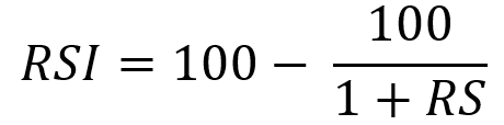
The RSI is calculated using a rather simple way. We first start by taking price differences of one period. This means that we have to subtract every closing price from the one before it. Then, we will calculate the smoothed average of the positive differences and divide it by the smoothed average of the negative differences. The last calculation gives us the Relative Strength which is then used in the RSI formula to be transformed into a measure between 0 and 100.
To calculate the Relative Strength Index through the following function, we need an OHLC array (not a data frame). This means that we will be looking at an array of 4 columns. The function for the Relative Strength Index is therefore:
def rsi(Data, lookback, close, where, width = 1, genre = 'Smoothed'):

    # Adding a few columns
    Data = adder(Data, 7)

    # Calculating Differences
    for i in range(len(Data)):

        Data[i, where] = Data[i, close] - Data[i - width, close]

    # Calculating the Up and Down absolute values
    for i in range(len(Data)):

        if Data[i, where] > 0:

            Data[i, where + 1] = Data[i, where]

        elif Data[i, where] < 0:

            Data[i, where + 2] = abs(Data[i, where])

    # Calculating the Smoothed Moving Average on Up and Down
    absolute values
    if genre == 'Smoothed':
      lookback = (lookback * 2) - 1 # From exponential to smoothed
      Data = ema(Data, 2, lookback, where + 1, where + 3)
      Data = ema(Data, 2, lookback, where + 2, where + 4)

    if genre == 'Simple':
      Data = ma(Data, lookback, where + 1, where + 3)
      Data = ma(Data, lookback, where + 2, where + 4)

    # Calculating the Relative Strength
    Data[:, where + 5] = Data[:, where + 3] / Data[:, where + 4]

    # Calculate the Relative Strength Index
    Data[:, where + 6] = (100 - (100 / (1 + Data[:, where + 5])))

    # Cleaning
    Data = deleter(Data, where, 6)
    Data = jump(Data, lookback)
return DataWe need to define the primal manipulation functions first in order to use the RSI’s function on OHLC data arrays.
# The function to add a certain number of columns
def adder(Data, times):

    for i in range(1, times + 1):

        z = np.zeros((len(Data), 1), dtype = float)
        Data = np.append(Data, z, axis = 1)
return Data# The function to deleter a certain number of columns
def deleter(Data, index, times):
for i in range(1, times + 1):
Data = np.delete(Data, index, axis = 1)
return Data# The function to delete a certain number of rows from the beginning
def jump(Data, jump):
Data = Data[jump:, ]
return DataCandlestick Charting
Candlestick charts are among the most famous ways to analyze the time series visually. They contain more information than a simple line chart and have more visual interpretability than bar charts. Many libraries in Python offer charting functions but being someone who suffers from malfunctioning import of libraries and functions alongside their fogginess, I have created my own simple function that charts candlesticks manually with no exogenous help needed.
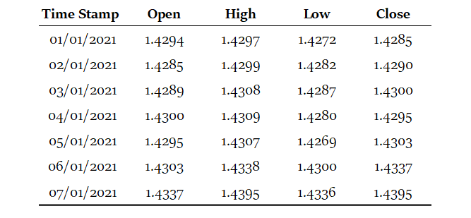
OHLC data is an abbreviation for Open, High, Low, and Close price. They are the four main ingredients for a timestamp. It is always better to have these four values together so that our analysis reflects more the reality. Here is a table that summarizes the OHLC data of hypothetical security:
Our job now is to plot the data so that we can visually interpret what kind of trend is the price following. We will start with the basic line plot before we move on to candlestick plotting.
Note that you can download the data manually or using Python. In case you have an excel file that has OHLC only data starting from the first row and column, you can import it using the below code snippet:
import numpy as np
import pandas as pd
# Importing the Data
my_ohlc_data = pd.read_excel('my_ohlc_data.xlsx')# Converting to Array
my_ohlc_data = np.array(my_ohlc_data)Plotting basic line plots is extremely easy in Python and requires only one line of code. We have to make sure that we have imported a library called matplotlib and then we will call a function that plots the data for us.
# Importing the necessary charting library
import matplotlib.pyplot as plt
# The syntax to plot a line chart
plt.plot(my_ohlc_data, color = 'black', label = 'EURUSD')# The syntax to add the label created above
plt.legend()# The syntax to add a grid
plt.grid()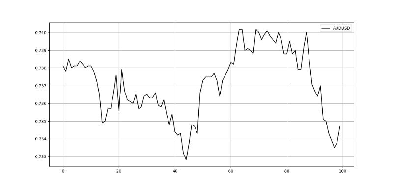
Now that we have seen how to create normal line charts, it is time to take it to the next level with candlestick charts. The way to do this with no complications is to think about vertical lines. Here is the intuition (followed by an application of the function below):
Select a lookback period. This is the number of values you want to appear on the chart.
Plot vertical lines for each row representing the highs and lows. For example, on OHLC data, we will use a matplotlib function called vlines which plots a vertical line on the chart using a minimum (low) value and a maximum (high value).
Make a color condition which states that if the closing price is greater than the opening price, then execute the selected block of code (which naturally contains the color green). Do this with the color red (bearish candle) and the color black (Doji candle).
Plot vertical lines using the conditions with the min and max values representing closing prices and opening prices. Make sure to make the line’s width extra big so that the body of the candle appears sufficiently enough that the chart is deemed a candlestick chart.
def ohlc_plot(Data, window, name):

    Chosen = Data[-window:, ]

    for i in range(len(Chosen)):

      plt.vlines(x = i, ymin = Chosen[i, 2], ymax = Chosen[i, 1], color = 'black', linewidth = 1)

      if Chosen[i, 3] > Chosen[i, 0]:
            color_chosen = 'green'
            plt.vlines(x = i, ymin = Chosen[i, 0], ymax = Chosen[i, 3], color = color_chosen, linewidth = 4)
if Chosen[i, 3] < Chosen[i, 0]:
color_chosen = 'red'
plt.vlines(x = i, ymin = Chosen[i, 3], ymax = Chosen[i, 0], color = color_chosen, linewidth = 4)
if Chosen[i, 3] == Chosen[i, 0]:
color_chosen = 'black'
plt.vlines(x = i, ymin = Chosen[i, 3], ymax = Chosen[i, 0], color = color_chosen, linewidth = 4)
plt.grid()
plt.title(name)# Using the function
ohlc_plot(my_ohlc_data, 50, '')
The Candlestick-RSI
The Candlestick RSI will be a regular 13-period RSI applied to the open prices and the closing prices, thus forming a simplistic type of candles where we can start seeing the psychology of the move. We can also add the high and low calculations so that we add them later into the signal. Therefore, the first step into creating the indicator is the following syntax:
lookback = 13# Calculating a 13-period RSI on opening prices
my_data = rsi(my_data, lookback, 0, 5, genre = 'Smoothed')# Calculating a 13-period RSI on high prices
my_data = rsi(my_data, lookback, 1, 6, genre = 'Smoothed')# Calculating a 13-period RSI on low prices
my_data = rsi(my_data, lookback, 2, 7, genre = 'Smoothed')# Calculating a 13-period RSI on closing prices
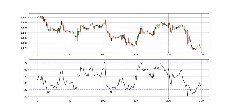
my_data = rsi(my_data, lookback, 3, 8, genre = 'Smoothed')The below chart shows the candlestick RSI in the first panel with the EURUSD hourly values in the second panel.
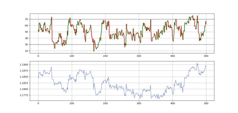
The above chart is a bit unusual, as we are used to putting the market price in the first panel. This time, we have switched and put the Candlestick-RSI above. We are now ready to derive the trading conditions based on a choice of candlestick patterns and the usual extremes strategy on the RSI.
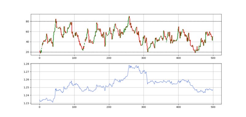
The above chart shows an example on the USDCAD where barriers of 20 and 80 are more suited to the Candlestick RSI. Note that the word barriers refer to the oversold/overbought levels.
Applying the Pattern Recognition Strategy
By fetching the conditions from candlestick pattern recognition and the RSI’s contrarian methods, we can develop the following trading rules:
Go long (Buy) whenever the current RSI (Based on closing prices) is greater than the current RSI (Based on opening prices) while simultaneously the current RSI (Based on low prices) is lower than the lower barrier of 20 (or 30 in the case of certain currency pairs).
Go short (Sell) whenever the current RSI (Based on closing prices) is lower than the current RSI (Based on opening prices) while simultaneously the current RSI (Based on high prices) is higher than the upper barrier of 80 (or 70 in the case of certain currency pairs).
def signal(Data):

    Data = adder(Data, 20)

    for i in range(len(Data)):

        if Data[i, 8] > Data[i, 5] and Data[i, 7] < lower_barrier and Data[i - 1, 9] == 0:
            Data[i, 9] = 1

        elif Data[i, 8] < Data[i, 5] and Data[i, 6] > upper_barrier  and Data[i - 1, 10] == 0:
            Data[i, 10] = -1

    return Data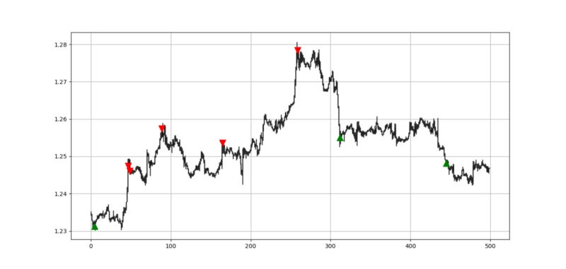
Evaluating the Signal Quality
Having had the signals, we now know when the algorithm would have placed its buy and sell orders, meaning, that we have an approximate replica of the past where can can control our decisions with no hindsight bias. We have to simulate how the strategy would have done given our conditions.
This means that we need to calculate the returns and analyze the performance metrics. Let us see a neutral metric that can give us somewhat a clue on the predictability of the indicator or the strategy. For this study, we will use the Signal Quality metric.
The signal quality is a metric that resembles a fixed holding period strategy. It is simply the reaction of the market after a specified time period following the signal. Generally, when trading, we tend to use a variable period where we open the positions and close out when we get a signal on the other direction or when we get stopped out (either positively or negatively). Sometimes, we close out at random time periods. Therefore, the signal quality is a very simple measure that assumes a fixed holding period and then checks the market level at that time point to compare it with the entry level. In other words, it measures market timing by checking the reaction of the market. For the performance evaluation to be unbiased, we will use three signal periods:
3 closing bars: This signal period relates to quick market timing strategies based on immediate reactions. In other words, we will be measuring the difference between the closing price 3 periods after the signal and the entry price at the trigger.
8 closing bars: This signal period relates to market timing strategies with some slight lag. In other words, we will be measuring the difference between the closing price 8 periods after the signal and the entry price at the trigger.
21 closing bars: This signal period relates to more important reactions that can even signal a change in the trend. In other words, we will be measuring the difference between the closing price 21 periods after the signal and the entry price at the trigger.
# Choosing an example of 3 periods
period = 3
def signal_quality(Data, closing, buy, sell, period, where):
Data = adder(Data, 1)
for i in range(len(Data)):
if Data[i, buy] == 1:
Data[i + period, where] = Data[i + period, closing] - Data[i, closing]if Data[i, sell] == -1:
Data[i + period, where] = Data[i, closing] - Data[i + period, closing]return Data# Using 3 Periods as a Window of signal Quality Check
my_data = signal_quality(my_data, 3, 6, 7, period, 8)positives = my_data[my_data[:, 8] > 0]
negatives = my_data[my_data[:, 8] < 0]# Calculating Signal Quality
signal_quality = len(positives) / (len(negatives) + len(positives))print('Signal Quality = ', round(signal_quality * 100, 2), '%')
# Output for 3 periods USDCAD Hourly: 53.42%
# Output for 8 periods USDCAD Hourly: 50.75%
# Output for 21 periods USDCAD Hourly: 51.09%A signal quality of 51.09% means that on 100 trades, we tend to see in 51 of the cases a higher price 21 periods after getting the signal. This shows that the pattern on hourly data of the USDCAD since 2011 (~ 600 trades) is not very predictive. The same job must be done on other pairs and other assets to have a full idea on the quality of the pattern.
Unlimited tweaking and patterns can be tested on this interesting and promising field. We will do that in the coming articles in further details.
If you want to see how to create all sorts of algorithms yourself, feel free to check out Lumiwealth. From algorithmic trading to blockchain and machine learning, they have hands-on detailed courses that I highly recommend.
Learn Algorithmic Trading with Python Lumiwealth
Learn how to create your own trading algorithms for stocks, options, crypto and more from the experts at Lumiwealth. Click to learn more
Summary
To sum up, what I am trying to do is to simply contribute to the world of objective technical analysis which is promoting more transparent techniques and strategies that need to be back-tested before being implemented. This way, technical analysis will get rid of the bad reputation of being subjective and scientifically unfounded.
I recommend you always follow the the below steps whenever you come across a trading technique or strategy:
Have a critical mindset and get rid of any emotions.
Back-test it using real life simulation and conditions.
If you find potential, try optimizing it and running a forward test.
Always include transaction costs and any slippage simulation in your tests.
Always include risk management and position sizing in your tests.
Finally, even after making sure of the above, stay careful and monitor the strategy because market dynamics may shift and make the strategy unprofitable.