Technical Indicators on Different Charting Systems to Improve Trading.
Using Technical Indicators on K’s Candlestick Charts as a Conviction Enhancer.
Complex strategies also form an important part of trading where they can detect hidden patterns that have more predictable outcomes than obvious patterns. In this article, we combine a variation of the famous RSI on a variation of the regular candlestick and a candlestick pattern as a filter to enhance the quality of the signals. The study is done in Python.
I have just published a new book after the success of New Technical Indicators in Python. It features a more complete description and addition of complex trading strategies with a GitHub page dedicated to the continuously updated code. If you feel that this interests you, feel free to visit the below link, or if you prefer the PDF version, you could contact me on LinkedIn.
Regular Candlestick Charts
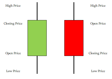
Candlesticks are a quick way to understand OHLC data and detect patterns. It is very straightforward and easy to interpret. A bullish (typically green) candle is when the market closes above its opening price. A bearish (typically red) candle is when the market closes below its opening price.
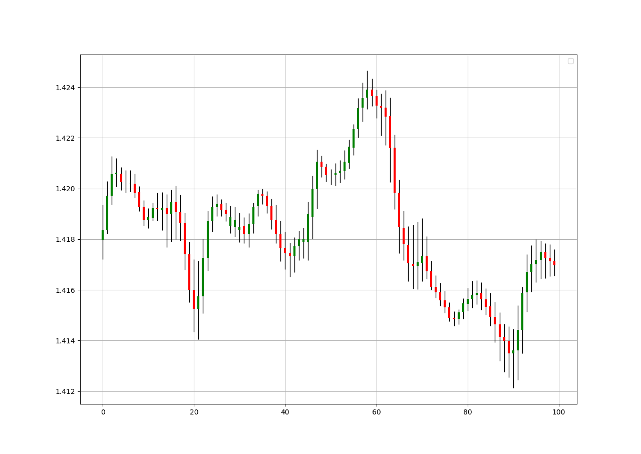
Let us see a full chart of candlestick to understand more how it is shown. The trend is clearly bullish with some corrections seen around the red candles. Notice the small candles where the opening price is almost the same as the closing price. This is called a Doji and signifies indecision and shows a possible reversal or consolidation.
def ohlc_plot(Data, window, name):

    Chosen = Data[-window:, ]

    for i in range(len(Chosen)):

        plt.vlines(x = i, ymin = Chosen[i, 2], ymax = Chosen[i, 1], color = 'black', linewidth = 1)

        if Chosen[i, 3] > Chosen[i, 0]:
            color_chosen = 'green'
            plt.vlines(x = i, ymin = Chosen[i, 0], ymax = Chosen[i, 3], color = color_chosen, linewidth = 2)                if Chosen[i, 3] < Chosen[i, 0]:
            color_chosen = 'red'
            plt.vlines(x = i, ymin = Chosen[i, 3], ymax = Chosen[i, 0], color = color_chosen, linewidth = 2)

        if Chosen[i, 3] == Chosen[i, 0]:
            color_chosen = 'black'
            plt.vlines(x = i, ymin = Chosen[i, 3], ymax = Chosen[i, 0], color = color_chosen, linewidth = 2)

    plt.grid()
    plt.title(name)
The above code plots a candlestick chart as shown. It requires an OHLC data array. The window variable refers to how many observations will be shown in the chart.
K’s Candlestick Charts
To create the K’s Candlestick chart, we need to transform the prices using the simple moving average formula. The steps are relatively easy:
Calculate a 2-period or 3-period Simple Moving Average of the opening price.
Calculate a 2-period or 3-period Simple Moving Average of the high price.
Calculate a 2-period or 3-period Simple Moving Average of the low price.
Calculate a 2-period or 3-period Simple Moving Average of the close price.
Then, we will treat the new four columns as the candlestick data while being careful from using them in trading as they are not real prices, but simple moving averages. We are interested in visually interpreting them. The charts below show the difference between the normal candlestick chart and the K’s candlestick chart.
The above plots show the EURUSD charted differently. The period used is 3. We can notice how smoother the K’s candlestick chart is compared to the noisy regular chart. By noisy, the meaning here is on the interpretability of the trend. When successive red or green candles are observed, the trend is easier to be determined.
The choice of 2 or 3 periods is subjective as I have noticed that they both have good signals. The 2-period is closer to reality and still contain the appropriate number of patterns while keeping the interpretability.
It becomes clear that we are interested in two things when analyzing the market using K’s Candlesticks:
Interpretability of the trend: Similar to the Heikin-Ashi, the K’s Candlestick chart smoothen out the data in order to remove the short-term noise and to deliver a clearer picture of the current trend.
Pattern Recognition: Doji and exhaustion patterns are more prevalent in the K’s candlesticks and therefore add a confirmation factor. They also work better than in regular charts according to my experience.
But also one more interesting thing that we will see in this article is the signals generated from the Relative Strength Index. We will develop a system that generates said signals on the K’s Candlestick charts and superimposes them on regular charts in order to visually interpret the signals. The back-testing is left to you to determine their efficacy.
def ma(Data, lookback, close, where):

  Data = adder(Data, 1)

  for i in range(len(Data)):

       try:
          Data[i, where] = (Data[i - lookback + 1:i + 1, close].mean())
     except IndexError:
                pass

    # Cleaning
    Data = jump(Data, lookback)

    return Data

def k_candlesticks(Data, opening, high, low, close, lookback, where):

    # Adding the necessary columns
    Data = adder(Data, 4)

    # Averaging the Open
    Data = ma(Data, lookback, opening, where)

    # Averaging the High
    Data = ma(Data, lookback, high, where + 1)

    # Averaging the Low
    Data = ma(Data, lookback, low, where + 2)

    # Averaging the Close
    Data = ma(Data, lookback, close, where + 3)

return DataThe Simple Relative Strength Index
The RSI is without a doubt the most famous momentum indicator out there, and this is to be expected as it has many strengths especially in ranging markets. It is also bounded between 0 and 100 which makes it easier to interpret. Also, the fact that it is famous, contributes to its potential.
This is because the more traders and portfolio managers look at the RSI, the more people will react based on its signals and this in turn can push market prices. Of course, we cannot prove this idea, but it is intuitive as one of the basis of Technical Analysis is that it is self-fulfilling.
The RSI is calculated using a rather simple way. We first start by taking price differences of one period. This means that we have to subtract every closing price from the one before it. Then, we will calculate the smoothed average of the positive differences and divide it by the smoothed average of the negative differences. The last calculation gives us the Relative Strength which is then used in the RSI formula to be transformed into a measure between 0 and 100.
To calculate the Relative Strength Index, we need an OHLC array (not a data frame). This means that we will be looking at an array of 4 columns. The function for the Relative Strength Index is therefore:
def rsi(Data, lookback, close, where, width = 1, genre = 'Smoothed'):

    # Adding a few columns
    Data = adder(Data, 7)

    # Calculating Differences
    for i in range(len(Data)):

        Data[i, where] = Data[i, close] - Data[i - width, close]

    # Calculating the Up and Down absolute values
    for i in range(len(Data)):

        if Data[i, where] > 0:

            Data[i, where + 1] = Data[i, where]

        elif Data[i, where] < 0:

            Data[i, where + 2] = abs(Data[i, where])

    # Calculating the Smoothed Moving Average on Up and Down
    absolute values
    if genre == 'Smoothed':

      lookback = (lookback * 2) - 1 # From exponential to smoothed
      Data = ema(Data, 2, lookback, where + 1, where + 3)
      Data = ema(Data, 2, lookback, where + 2, where + 4)

    if genre == 'Simple':

      Data = ma(Data, lookback, where + 1, where + 3)
      Data = ma(Data, lookback, where + 2, where + 4)

    # Calculating the Relative Strength
    Data[:, where + 5] = Data[:, where + 3] / Data[:, where + 4]

    # Calculate the Relative Strength Index
    Data[:, where + 6] = (100 - (100 / (1 + Data[:, where + 5])))

    # Cleaning
    Data = deleter(Data, where, 6)
    Data = jump(Data, lookback)

    return Data
If you are also interested by more technical indicators and using Python to create strategies, then my best-selling book on Technical Indicators may interest you:
We need to define the primal manipulation functions first in order to use the RSI’s function on OHLC data arrays.
# The function to add a certain number of columns
def adder(Data, times):

    for i in range(1, times + 1):

        z = np.zeros((len(Data), 1), dtype = float)
        Data = np.append(Data, z, axis = 1)

    return Data

# The function to deleter a certain number of columns
def deleter(Data, index, times):

    for i in range(1, times + 1):

        Data = np.delete(Data, index, axis = 1)

    return Data

# The function to delete a certain number of rows from the beginning
def jump(Data, jump):

    Data = Data[jump:, ]

return DataCreating the Strategy
The idea is clear, using the 14-period Simple Relative Strength Index through values on the K’s Candlestick charts to determine signals. However, since the K’s charts are a simple transformation of the regular price data, we can add another condition to make it into a more complete strategy. Below are the conditions in detail:
First we need to look for Doji patterns. These are candles that look like a plus sign. They signal indecision and reversal in the market.
Second, we need to have the 14-period RSI (applied on the K’s chart) to be less than 25 for a bullish signal and to be more than 75 for a bearish signal.
Having the RSI’s condition will make the Doji’s condition simpler as we do not need to code the trend into the Doji’s algorithm so that it knows whether it is a bullish or bearish Doji. Using the RSI will make the algorithm aware of the direction. Let us code everything we need right up until the conditions:
# Creating the K's Candlestick Chart based on an OHLC Dataset where K's OHLC starts at column 5
my_data = k_candlesticks(my_data, 0, 1, 2, 3, 3, 5)

# Calculating a 5-period Simple RSI on the closing prices of the K's Candlestick Chart
my_data= rsi(my_data, 14, 8, 9, genre = 'Simple')As explained above, the conditions of the strategy are:
Go long (Buy) whenever the 14-period RSI is at or below 25 while the market (reflected by the K’s Candlestick chart) has just closed on a Doji pattern at the same time. This means that the closing price must be a Doji and its respective RSI reading is at or below 25.
Go short (Sell) whenever the 14-period RSI is at or above 75 while the market (reflected by the K’s Candlestick chart) has just closed on a Doji pattern at the same time. This means that the closing price must be a Doji and its respective RSI reading is at or above 75.
def signal(Data, rsi_col, opening, close, buy, sell):

    Data = adder(Data, 10)
    Data = rounding(Data, 4) # Important for the Doji detection

    for i in range(len(Data)):

        if Data[i, rsi_col] <= lower_barrier and Data[i, opening] == Data[i, close]:
            Data[i, buy] = 1

        elif Data[i, rsi_col] >= upper_barrier and Data[i, opening] == Data[i, close]:
            Data[i, sell] = -1

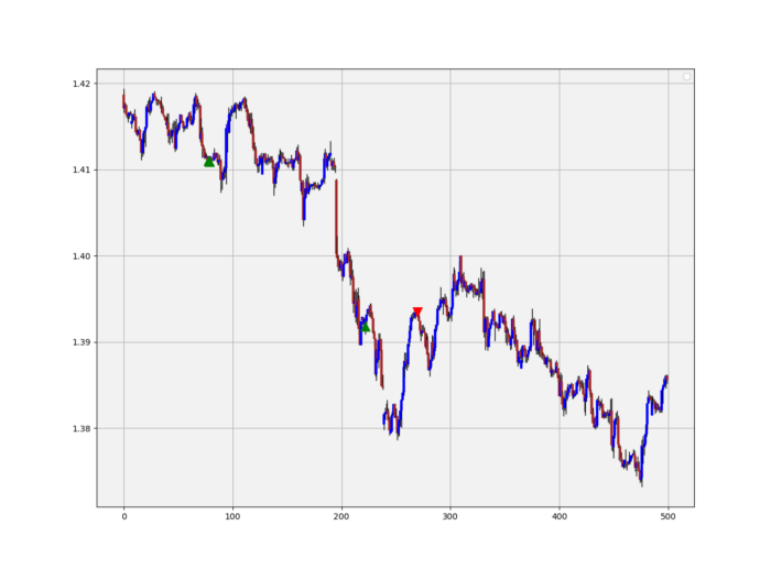
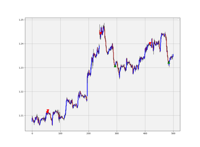
return DataThe above signal chart shows the different triggers we have gotten following the strategy. The green upward pointing arrows signify a buy signal, meaning that a bullish leg may occur while the red downward pointing arrows signify a sell (short) signal, meaning that a bearish leg or a corrective leg may occur.
The best way to use this strategy is to back-test it first and become convinced by it, and then combine it with other techniques that you prefer. Generally, since the Doji is a very short-term pattern and the RSI is used for ranging limited configuration, the strategy works only for short-term reactions and is fitted better for scalping techniques. We are not trying to predict a major market top or bottom.
Optimization is possible by tweaking the lookback period on the RSI or even its genre (smoothed or simple). Also, we can add other candlestick patterns and include moving averages into the formula.
Conclusion & Important Disclaimer
Remember to always do your back-tests. You should always believe that other people are wrong. My indicators and style of trading may work for me but maybe not for you.
I am a firm believer of not spoon-feeding. I have learnt by doing and not by copying. You should get the idea, the function, the intuition, the conditions of the strategy, and then elaborate (an even better) one yourself so that you back-test and improve it before deciding to take it live or to eliminate it. My choice of not providing Back-testing results should lead the reader to explore more herself the strategy and work on it more. That way you can share with me your better strategy and we will get rich together.
To sum up, are the strategies I provide realistic? Yes, but only by optimizing the environment (robust algorithm, low costs, honest broker, proper risk management, and order management). Are the strategies provided only for the sole use of trading? No, it is to stimulate brainstorming and getting more trading ideas as we are all sick of hearing about an oversold RSI as a reason to go short or a resistance being surpassed as a reason to go long. I am trying to introduce a new field called Objective Technical Analysis where we use hard data to judge our techniques rather than rely on outdated classical methods.
One Last Word
I have recently started an NFT collection that aims to support different humanitarian and medical causes. The Society of Light is a set of limited collectibles which will help make the world slightly better as each sale will see a percentage of it sent directly to the charity attributed to the avatar. As I always say, nothing better than a bullet list to outline the benefits of buying these NFT’s:
High-potential gain: By concentrating the remaining sales proceedings on marketing and promoting The Society of Light, I am aiming to maximize their value as much as possible in the secondary market. Remember that trading in the secondary market also means that a portion of royalties will be donated to the same charity.
Art collection and portfolio diversification: Having a collection of avatars that symbolize good deeds is truly satisfying. Investing does not need to only have selfish needs even though there is nothing wrong with investing to make money. But what about investing to make money, help others, and collect art?
Donating to your preferred cause(s): This is a flexible way of allocating different funds to your charities.
A free copy of my book in PDF: Any buyer of any NFT will receive a free copy of my latest book shown in the link of the article.


