Technical Indicators on Different Charting Systems to Improve Trading
Using Technical Indicators on K's Candlestick Charts as a Conviction Enhancer
Complex strategies also form an important part of trading where they can detect hidden patterns that have more predictable outcomes than obvious patterns. In this article, we combine a variation of the famous RSI on a variation of the regular candlestick and a candlestick pattern as a filter to enhance the quality of the signals. The study is done in Python.
I have released a new book called “Contrarian Trading Strategies in Python”. It features a lot of advanced contrarian indicators and strategies with a GitHub page dedicated to the continuously updated code. If you are interested, you could buy the PDF version directly through a PayPal payment of 9.99 EUR.
Please include your email in the note before paying so that you receive it on the right address. Also, once you receive it, make sure to download it through google drive.
Pay Kaabar using PayPal.Me
If you accept cookies, we’ll use them to improve and customize your experience and enable our partners to show you…www.paypal.com
Regular Candlestick Charts
Candlesticks are a quick way to understand OHLC data and detect patterns. It is very straightforward and easy to interpret. A bullish (typically green) candle is when the market closes above its opening price. A bearish (typically red) candle is when the market closes below its opening price.
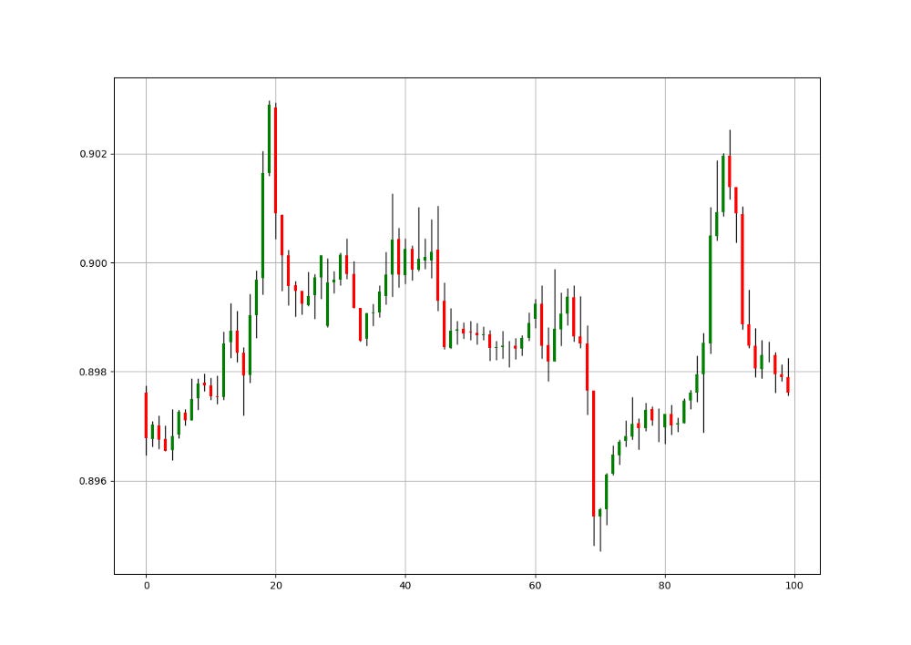
Let us see a full chart of candlestick to understand more how it is shown. The trend is clearly bullish with some corrections seen around the red candles. Notice the small candles where the opening price is almost the same as the closing price. This is called a Doji and signifies indecision and shows a possible reversal or consolidation.
def ohlc_plot(Data, window, name):

    Chosen = Data[-window:, ]

    for i in range(len(Chosen)):

        plt.vlines(x = i, ymin = Chosen[i, 2], ymax = Chosen[i, 1], color = 'black', linewidth = 1)

        if Chosen[i, 3] > Chosen[i, 0]:
            color_chosen = 'green'
            plt.vlines(x = i, ymin = Chosen[i, 0], ymax = Chosen[i, 3], color = color_chosen, linewidth = 2)
if Chosen[i, 3] < Chosen[i, 0]:
color_chosen = 'red'
plt.vlines(x = i, ymin = Chosen[i, 3], ymax = Chosen[i, 0], color = color_chosen, linewidth = 2)
if Chosen[i, 3] == Chosen[i, 0]:
color_chosen = 'black'
plt.vlines(x = i, ymin = Chosen[i, 3], ymax = Chosen[i, 0], color = color_chosen, linewidth = 2)
plt.grid()
plt.title(name)The above code plots a candlestick chart as shown. It requires an OHLC data array. The window variable refers to how many observations will be shown in the chart.
K’s Candlestick Charts
To create the K’s Candlestick chart, we need to transform the prices using the simple moving average formula. The steps are relatively easy:
Calculate a 2-period or 3-period Simple Moving Average of the opening price.
Calculate a 2-period or 3-period Simple Moving Average of the high price.
Calculate a 2-period or 3-period Simple Moving Average of the low price.
Calculate a 2-period or 3-period Simple Moving Average of the close price.
Then, we will treat the new four columns as the candlestick data while being careful from using them in trading as they are not real prices, but simple moving averages. We are interested in visually interpreting them. The charts below show the difference between the normal candlestick chart and the K’s candlestick chart.
The above plots show the EURUSD charted differently. The period used is 3. We can notice how smoother the K’s candlestick chart is compared to the noisy regular chart. By noisy, the meaning here is on the interpretability of the trend. When successive red or green candles are observed, the trend is easier to be determined.
The choice of 2 or 3 periods is subjective as I have noticed that they both have good signals. The 2-period is closer to reality and still contain the appropriate number of patterns while keeping the interpretability.
It becomes clear that we are interested in two things when analyzing the market using K’s Candlesticks:
Interpretability of the trend: Similar to the Heikin-Ashi, the K’s Candlestick chart smoothes out the data in order to remove the short-term noise and to deliver a clearer picture of the current trend.
Pattern Recognition: Doji and exhaustion patterns are more prevalent in the K’s candlesticks and therefore add a confirmation factor. They also work better than in regular charts according to my experience.
But also one more interesting thing that we will see in this article is the signals generated from the Relative Strength Index. We will develop a system that generates said signals on the K’s Candlestick charts and superimposes them on regular charts in order to visually interpret the signals. The back-testing is left to you to determine their efficacy.
def ma(Data, lookback, close, where):Data = adder(Data, 1)
for i in range(len(Data)):try:
Data[i, where] = (Data[i - lookback + 1:i + 1, close].mean())
except IndexError:
pass# Cleaning
Data = jump(Data, lookback)
return Datadef k_candlesticks(Data, opening, high, low, close, lookback, where):
# Adding the necessary columns
Data = adder(Data, 4)
# Averaging the Open
Data = ma(Data, lookback, opening, where)
# Averaging the High
Data = ma(Data, lookback, high, where + 1)
# Averaging the Low
Data = ma(Data, lookback, low, where + 2)
# Averaging the Close
Data = ma(Data, lookback, close, where + 3)
return DataThe Simple Relative Strength Index
The RSI is without a doubt the most famous momentum indicator out there, and this is to be expected as it has many strengths especially in ranging markets. It is also bounded between 0 and 100 which makes it easier to interpret. Also, the fact that it is famous, contributes to its potential.
This is because the more traders and portfolio managers look at the RSI, the more people will react based on its signals and this in turn can push market prices. Of course, we cannot prove this idea, but it is intuitive as one of the basis of Technical Analysis is that it is self-fulfilling.
The RSI is calculated using a rather simple way. We first start by taking price differences of one period. This means that we have to subtract every closing price from the one before it. Then, we will calculate the smoothed average of the positive differences and divide it by the smoothed average of the negative differences. The last calculation gives us the Relative Strength which is then used in the RSI formula to be transformed into a measure between 0 and 100.
To calculate the Relative Strength Index, we need an OHLC array (not a data frame). This means that we will be looking at an array of 4 columns. The function for the Relative Strength Index is therefore:
def rsi(Data, lookback, close, where, width = 1, genre = 'Smoothed'):

    # Adding a few columns
    Data = adder(Data, 7)

    # Calculating Differences
    for i in range(len(Data)):

        Data[i, where] = Data[i, close] - Data[i - width, close]

    # Calculating the Up and Down absolute values
    for i in range(len(Data)):

        if Data[i, where] > 0:

            Data[i, where + 1] = Data[i, where]

        elif Data[i, where] < 0:

            Data[i, where + 2] = abs(Data[i, where])

    # Calculating the Smoothed Moving Average on Up and Down
    absolute values
    if genre == 'Smoothed':
lookback = (lookback * 2) - 1 # From exponential to smoothed
Data = ema(Data, 2, lookback, where + 1, where + 3)
Data = ema(Data, 2, lookback, where + 2, where + 4)
if genre == 'Simple':Data = ma(Data, lookback, where + 1, where + 3)
Data = ma(Data, lookback, where + 2, where + 4)
# Calculating the Relative Strength
Data[:, where + 5] = Data[:, where + 3] / Data[:, where + 4]
# Calculate the Relative Strength Index
Data[:, where + 6] = (100 - (100 / (1 + Data[:, where + 5])))
# Cleaning
Data = deleter(Data, where, 6)
Data = jump(Data, lookback)return DataWe need to define the primal manipulation functions first in order to use the RSI’s function on OHLC data arrays.
# The function to add a certain number of columns
def adder(Data, times):

    for i in range(1, times + 1):

        z = np.zeros((len(Data), 1), dtype = float)
        Data = np.append(Data, z, axis = 1)
return Data# The function to deleter a certain number of columns
def deleter(Data, index, times):
for i in range(1, times + 1):
Data = np.delete(Data, index, axis = 1)
return Data# The function to delete a certain number of rows from the beginning
def jump(Data, jump):
Data = Data[jump:, ]
return DataCreating the Strategy
The idea is clear, using the 14-period Simple Relative Strength Index through values on the K’s Candlestick charts to determine signals. However, since the K’s charts are a simple transformation of the regular price data, we can add another condition to make it into a more complete strategy. Below are the conditions in detail:
First we need to look for Doji patterns. These are candles that look like a plus sign. They signal indecision and reversal in the market.
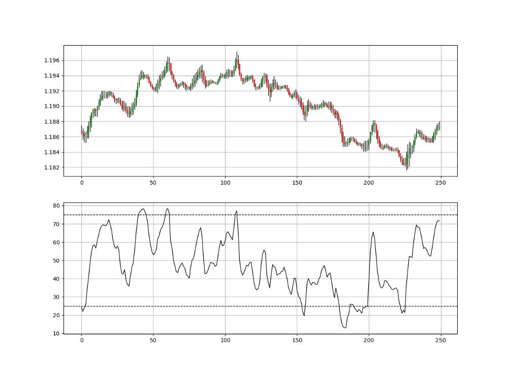
Second, we need to have the 14-period RSI (applied on the K’s chart) to be less than 25 for a bullish signal and to be more than 75 for a bearish signal.
Having the RSI’s condition will make the Doji’s condition simpler as we do not need to code the trend into the Doji’s algorithm so that it knows whether it is a bullish or bearish Doji. Using the RSI will make the algorithm aware of the direction. Let us code everything we need right up until the conditions:
# Creating the K's Candlestick Chart based on an OHLC Dataset where K's OHLC starts at column 5
my_data = k_candlesticks(my_data, 0, 1, 2, 3, 3, 5)
# Calculating a 5-period Simple RSI on the closing prices of the K's Candlestick Chart
my_data= rsi(my_data, 14, 8, 9, genre = 'Simple')# The function to plot the above chart
def indicator_plot_double(Data, opening, high, low, close, second_panel, window = 250):fig, ax = plt.subplots(2, figsize = (10, 5))Chosen = Data[-window:, ]
for i in range(len(Chosen)):
ax[0].vlines(x = i, ymin = Chosen[i, low], ymax = Chosen[i, high], color = 'black', linewidth = 1)
if Chosen[i, close] > Chosen[i, opening]:
color_chosen = 'green'
ax[0].vlines(x = i, ymin = Chosen[i, opening], ymax = Chosen[i, close], color = color_chosen, linewidth = 2)if Chosen[i, close] < Chosen[i, opening]:
color_chosen = 'red'
ax[0].vlines(x = i, ymin = Chosen[i, close], ymax = Chosen[i, opening], color = color_chosen, linewidth = 2)
if Chosen[i, close] == Chosen[i, opening]:
color_chosen = 'black'
ax[0].vlines(x = i, ymin = Chosen[i, close], ymax = Chosen[i, opening], color = color_chosen, linewidth = 2)
ax[0].grid()
ax[1].plot(Data[-window:, second_panel], color = 'black', linewidth = 1)
ax[1].grid()
ax[1].legend()As explained above, the conditions of the strategy are:
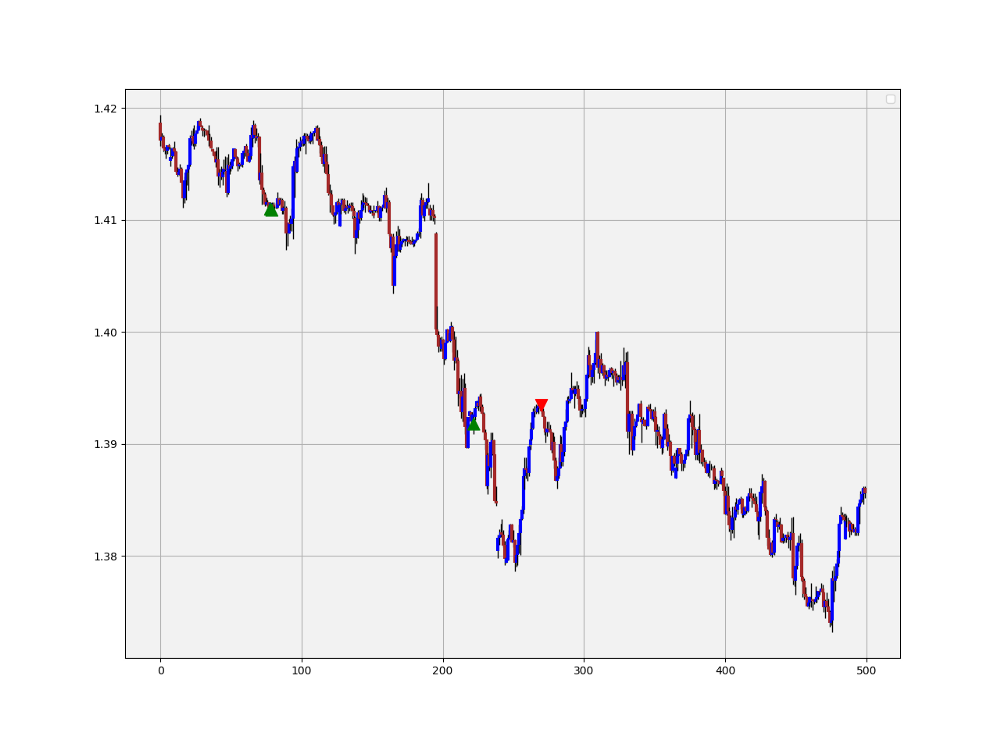
Go long (Buy) whenever the 14-period RSI is at or below 25 while the market (reflected by the K’s Candlestick chart) has just closed on a Doji pattern at the same time. This means that the closing price must be a Doji and its respective RSI reading is at or below 25.
Go short (Sell) whenever the 14-period RSI is at or above 75 while the market (reflected by the K’s Candlestick chart) has just closed on a Doji pattern at the same time. This means that the closing price must be a Doji and its respective RSI reading is at or above 75.
def signal(Data, rsi_col, opening, close, buy, sell):

    Data = adder(Data, 10)
    Data = rounding(Data, 4) # Important for the Doji detection

    for i in range(len(Data)):

        if Data[i, rsi_col] <= lower_barrier and Data[i, opening] == Data[i, close]:
            Data[i, buy] = 1

        elif Data[i, rsi_col] >= upper_barrier and Data[i, opening] == Data[i, close]:
            Data[i, sell] = -1

return DataThe above signal chart shows the different triggers we have gotten following the strategy. The green upward pointing arrows signify a buy signal, meaning that a bullish leg may occur while the red downward pointing arrows signify a sell (short) signal, meaning that a bearish leg or a corrective leg may occur.
The best way to use this strategy is to back-test it first and become convinced by it, and then combine it with other techniques that you prefer. Generally, since the Doji is a very short-term pattern and the RSI is used for ranging limited configuration, the strategy works only for short-term reactions and is fitted better for scalping techniques. We are not trying to predict a major market top or bottom.
Optimization is possible by tweaking the lookback period on the RSI or even its genre (smoothed or simple). Also, we can add other candlestick patterns and include moving averages into the formula.
Make sure to focus on the concepts and not the code. The most important thing is to comprehend the techniques and strategies. The code is a matter of execution but the idea is something you cook in your head for a while.
Check out my weekly market sentiment report to understand the current positioning and to estimate the future direction of several major markets through complex and simple models working side by side. Find out more about the report through this link:
Coalescence Report 1st May — 8th May 2022
This report covers the weekly market sentiment and positioning and any changes that have occurred which might present…coalescence.substack.com
Summary
To sum up, what I am trying to do is to simply contribute to the world of objective technical analysis which is promoting more transparent techniques and strategies that need to be back-tested before being implemented. This way, technical analysis will get rid of the bad reputation of being subjective and scientifically unfounded.
I recommend you always follow the the below steps whenever you come across a trading technique or strategy:
Have a critical mindset and get rid of any emotions.
Back-test it using real life simulation and conditions.
If you find potential, try optimizing it and running a forward test.
Always include transaction costs and any slippage simulation in your tests.
Always include risk management and position sizing in your tests.
Finally, even after making sure of the above, stay careful and monitor the strategy because market dynamics may shift and make the strategy unprofitable.


