Plotting Candlestick Charts in Python — The Easy Way.
The Easy Way to Plot Quick Candlestick Charts With No Specialized Libraries.
Candlestick charts are among the most famous ways to analyze the time series visually. They contain more information than a simple line chart and have more visual interpretability than bar charts. Many libraries in Python offer charting functions but being someone who suffers from malfunctioning import of libraries and functions alongside their fogginess, I have created my own simple function that charts candlesticks manually with no exogenous help needed.
I have just published a new book after the success of my previous one “New Technical Indicators in Python”. It features a more complete description and addition of structured trading strategies with a GitHub page dedicated to the continuously updated code. If you feel that this interests you, feel free to visit the below link, or if you prefer to buy the PDF version, you could contact me on LinkedIn.
Introduction to OHLC Data
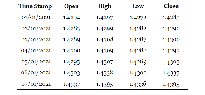
OHLC data is an abbreviation for Open, High, Low, and Close price. They are the four main ingredients for a timestamp. It is always better to have these four values together so that our analysis reflects more the reality. Here is a table that summarizes the OHLC data of a hypothetical security:
Our job now is to plot the data so that we can visually interpret what kind of trend is the price following. We will start with the basic line plot before we move on to candlestick plotting.
Note that you can download the data manually or using Python. In case you have an excel file that has OHLC only data starting from the first row and column, you can import it using the below code snippet:
import numpy as np
import pandas as pd

# Importing the Data
my_ohlc_data = pd.read_excel('my_ohlc_data.xlsx')

# Converting to Array
my_ohlc_data = np.array(my_ohlc_data)
Basic Line Plot
Plotting basic line plots is extremely easy in Python and requires only one line of code. We have to make sure that we have imported a library called matplotlib and then we will call a function that plots the data for us.
# Importing the necessary charting library
import matplotlib.pyplot as plt

# The syntax to plot a line chart
plt.plot(my_ohlc_data, color = 'black', label = 'EURUSD')

# The syntax to add the label created above
plt.legend()

# The syntax to add a grid
plt.grid()Candlestick Plot
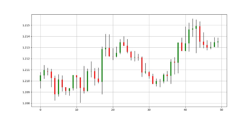
Now that we have seen how to create normal line charts, it is time to take it to the next level with candlestick charts. The way to do this with no complications is to think about vertical lines. Here is the intuition (followed by an application of the function below):
Select a lookback period. This is the number of values you want to appear on the chart.
Plot vertical lines for each row representing the highs and lows. For example, on OHLC data, we will use a matplotlib function called vlines which plots a vertical line on the chart using a minimum (low) value and a maximum (high value).
Make a color condition which states that if the closing price is greater than the opening price, then execute the selected block of code (which naturally contains the color green). Do this with the color red (bearish candle) and the color black (Doji candle).
Plot vertical lines using the conditions with the min and max values representing closing prices and opening prices. Make sure to make the line’s width extra big so that the body of the candle appears sufficiently enough that the chart is deemed a candlestick chart.
def ohlc_plot(Data, window, name):

    Chosen = Data[-window:, ]

    for i in range(len(Chosen)):

      plt.vlines(x = i, ymin = Chosen[i, 2], ymax = Chosen[i, 1], color = 'black', linewidth = 1)

        if Chosen[i, 3] > Chosen[i, 0]:
            color_chosen = 'green'
            plt.vlines(x = i, ymin = Chosen[i, 0], ymax = Chosen[i, 3], color = color_chosen, linewidth = 4)        if Chosen[i, 3] < Chosen[i, 0]:
            color_chosen = 'red'
            plt.vlines(x = i, ymin = Chosen[i, 3], ymax = Chosen[i, 0], color = color_chosen, linewidth = 4)

        if Chosen[i, 3] == Chosen[i, 0]:
            color_chosen = 'black'
            plt.vlines(x = i, ymin = Chosen[i, 3], ymax = Chosen[i, 0], color = color_chosen, linewidth = 4)

    plt.grid()
    plt.title(name)# Using the function
ohlc_plot(my_ohlc_data, 50, '')Adding a Simple Moving Average to the Chart
We can add technical overlay indicators to the chart easily. Let us see how to do this with a simple moving average. But before, we can define what moving averages are before we proceed to adding one to the above chart.
Moving averages help us confirm and ride the trend. They are the most known technical indicator, and this is because of their simplicity and their proven track record of adding value to the analyses. We can use them to find support and resistance levels, stops, and targets, and to understand the underlying trend. This versatility makes them an indispensable tool in our trading arsenal.
As the name suggests, this is your plain simple mean that is used everywhere in statistics and basically any other part in our lives. It is simply the total values of the observations divided by the number of observations. Mathematically speaking, it can be written down as:
We can use Python to code a simple moving average easily following this function:
def ma(Data, lookback, what, where):

  for i in range(len(Data)):
    try:
      Data[i, where] = (Data[i - lookback + 1:i + 1, what].mean())

            except IndexError:
                pass
    return Data
Now, after using the above function and the candlestick charting function as the below:
# Plot the Candlestick chart
ohlc_plot(my_ohlc_data, 50, '')

# Calculate a 20-period Moving Average
my_ohlc_data = ma(my_ohlc_data, 20, 3, 4)

# Plot the Moving Average
plt.plot(my_ohlc_data[-50:, 4], label = '20-period Moving Average')

# Add the label of the Moving Average
plt.legend()
We can obtain the following candlestick plot with its 20-period moving average.
Remember to add at least one column to your array before using the moving average function. This ensures that the output gets a place to be stored.
def adder(Data, times):

    for i in range(1, times + 1):

        z = np.zeros((len(Data), 1), dtype = float)
        Data = np.append(Data, z, axis = 1)

    return Data

# Using the Function
my_ohlc_data = adder(my_ohlc_data, 1)
Conclusion
Candlestick charting a very useful in detecting patterns that can have valuable information in them about market psychology. Being able to code these simple techniques is something that is considered crucial in today’s trading. Without a doubt, the world of finance and computer science are intertwined together and will continue being so for the foreseeable future.


