
Building an IQR-Based Technical Indicator
Going in Details Through an Impressive and Robust Indicator


When you build any volatility or bands-type indicator on price (such as Bollinger Bands), you are making a choice about how you want to summarize two things:
A typical price
How far prices tend to stray from that typical value
For most classical indicators, those roles are played by:
Mean (average) as the typical price
Standard deviation as the dispersion around that mean
In this article, we will swap both for their robust cousins:
Median instead of mean
Interquartile range (IQR) instead of standard deviation
And we do it in a concrete way: a rolling median over 20 periods, and bands based on a multiplier of 2 times the interquartile range. Hence, a Bollinger Bands’ cousin.
To get there properly, we need to be very clear on what the median and IQR actually are, both conceptually and mathematically.
The Median - A Robust Center of the Market
Take a price series Pt and imagine looking at a rolling window of nnn prices, say the last 20 bars:
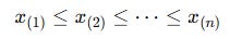
The goal is to summarize this whole set with a single number that captures central tendency. Given a sample of n numbers:
we first sort them in ascending order:
The notation x(k) means “the kth smallest” value, also called the kth order statistic.
The median, typically written as x~ or median(x), is:
If n is odd:
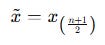
If nnn is even:
In words:
Sort the values.
If there is an exact middle one, that is the median.
If the middle is between two values, take the average of those two.
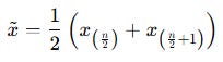
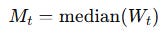
Applied to prices, in a 20-bar rolling window, your median price at time t is:
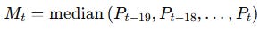
This Mt is what you will use as the middle band of your IQR-based technical indicator. For financial time series, the median has a very concrete advantage over the mean:
The mean reacts strongly to outliers. A single spike can shift it significantly.
The median cares only about the ordering, not the magnitude of the extremes. As long as fewer than 50 percent of the values are corrupted, the median stays anchored.
Formally, you can say: the median has a breakdown point of 50 percent, while the mean’s breakdown point is effectively 0 percent.
In practice:
A random price spike will push your moving average all over the place.
The median will barely move, which makes it a cleaner central reference for robust bands.
Quartiles and the Interquartile Range (IQR)
Once we’ve chosen the median as our center, we need a robust measure of spread around that center. Enter quartiles and the IQR.
Again, start from the sorted sample:
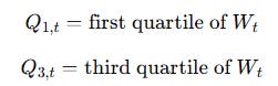
Quartiles divide the data into four groups with equal probability mass (as equal as possible in a finite sample).
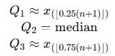
First quartile Q1: roughly the 25th percentile
Second quartile Q2: the 50th percentile, which is exactly the median
Third quartile Q3: roughly the 75th percentile
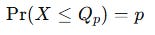
In terms of a cumulative proportion, the pth quantile Qp is the value such that:
In a sample, we approximate this by looking at the sorted values and picking the appropriate position. Different software uses slightly different interpolation rules for quantiles, but conceptually:
The Signal Beyond 🚀
From classic tools that have stood the test of time to fresh innovations like multi-market RSI heatmaps, COT reports, seasonality, and pairs trading recommendation system, the new report is designed to give you a sharper edge in navigating the markets.
Free trial available.
Visually, if you imagine a sorted list of prices:
The bottom quarter sits below Q1.
Half lie between Q1 and Q3.
The top quarter sits above Q3.
The interquartile range (IQR) is defined as:
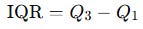
It measures the width of the middle 50 percent of the data.
In a 20-bar window of prices:
Interpretation:
A large IQR means that prices in the middle 50 percent are spread out. Volatility, as experienced in the typical range of prices, is high.
A small IQR means that the central 50 percent of prices are tightly clustered. Market action is relatively quiet around the median.
Unlike standard deviation, the IQR is largely unaffected by extreme outliers. If you have one crazy spike, it will probably land outside the central 50 percent and barely change the IQR.
If you want to connect this to more familiar territory like Bollinger Bands, there is a useful fact:
For a normal distribution:
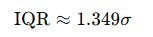
where σ is the standard deviation.
Rearranging:
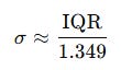
This means that in a roughly normal world, multiplying the IQR by 2 corresponds to something like:
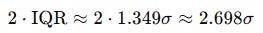
So, an IQR-based band with multiplier 2 is wider than a classical 2σ band, but in the same ballpark.
Building an IQR-Based Technical Indicator
Now we combine these pieces into a concrete indicator.
Let:
Window length n = 20
Multiplier k = 2
At each time t, consider the rolling window of prices:
From this window, compute:
Median (middle band):
First and third quartiles:
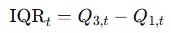
Interquartile range:
Now define your bands. Using the median as the central line:
Building this in Pine Script (TradingView’s programming language) yields the following code:
//@version=6
indicator(”Interquartile Range Bands”, shorttitle=”IQRB”, overlay=true)
// Inputs
length = input.int(14, “Length”, minval=1)
mult = input.float(1.5, “Multiplier”, minval=0, step=0.1)
src = input.source(close, “Source”)
// Percentiles
q1 = ta.percentile_nearest_rank(src, length, 25)
median = ta.percentile_nearest_rank(src, length, 50)
q3 = ta.percentile_nearest_rank(src, length, 75)
// IQR and bands
iqr = q3 - q1
upperBand = q3 + mult * iqr
lowerBand = q1 - mult * iqr
// Plots
upperBandPlot = plot(upperBand, “Upper”, color=color.new(#138484, 0))
plot(median, “Median”, color=color.new(#741b47, 0))
lowerBandPlot = plot(lowerBand, “Lower”, color=color.new(#138484, 0))
// Background fill
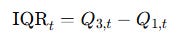
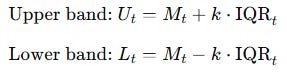
fill(upperBandPlot, lowerBandPlot, title=”Background”, color=color.new(#ffd966, 84))Visualizing the indicator on real-time prices:
It is to be treated like a normal Bollinger Bands indicator.
What you should retain:
The median over the last 20 bars is a fair value that resists spikes and weird one-off prints.
The IQR tracks how wide the normal market movements are, ignoring the most extreme 25 percent on both sides.
The indicator does not predict direction. It gives you a robust frame of reference. Price hugging the upper band, or repeatedly testing the lower band, can be interpreted similarly to Bollinger-type behavior, but with less noise from outliers.
Do you want to master Deep Learning techniques tailored for time series, trading, and market analysis🔥?
My book breaks it all down from basic machine learning to complex multi-period LSTM forecasting while going through concepts such as fractional differentiation and forecasting thresholds.
Get your copy here 📖!
Is it more useful than BB?