Advanced Support Vector Regression with Technical Indicators in Python
Round 3 of Using Technical Indicators as Features for an ML Model
SVR is one of the powerful but mixed models where it has a strong fan base but also a strong haters base. In this article, we’ll walk through:
Which technical indicators make good inputs.
How to engineer features for the model.
Building the SVR pipeline.
Evaluating performance with classification metrics.
Let’s dive in.
Generating Synthetic Data and Calculating Technical Indicators
The first step is to generate some data, then apply technical indicators onto it. Use the following code:
import numpy as np
import pandas as pd

np.random.seed(42)
n = 500
t = np.arange(n)
trend = 0.05 * t
seasonality = 5 * np.sin(2 * np.pi * t / 50)
noise = np.random.normal(0, 2, n)
prices = trend + seasonality + noise

df = pd.DataFrame({'Close': prices})
Now, create the technical indicators:
The relative strength momentum (RSI) to measure the market’s momentum.
The MACD to measure the market’s trend.
Bollinger bands width to measure the market’s volatility.
The slope to measure the bias of the trend.
def add_technical_indicators(df):
    df['SMA_10'] = df['Close'].rolling(10).mean()
    df['SMA_30'] = df['Close'].rolling(30).mean()
    df['SMA_slope'] = df['SMA_10'].diff()

    # RSI
    delta = df['Close'].diff()
    gain = delta.where(delta > 0, 0)
    loss = -delta.where(delta < 0, 0)
    avg_gain = gain.rolling(14).mean()
    avg_loss = loss.rolling(14).mean()
    rs = avg_gain / avg_loss
    df['RSI'] = 100 - (100 / (1 + rs))

    # MACD
    ema12 = df['Close'].ewm(span=12, adjust=False).mean()
    ema26 = df['Close'].ewm(span=26, adjust=False).mean()
    df['MACD'] = ema12 - ema26

    # Bollinger Band width
    ma = df['Close'].rolling(20).mean()
    std = df['Close'].rolling(20).std()
    df['BB_width'] = 2 * std / ma

    return df.dropna()

df = add_technical_indicators(df)
Applying the Model and Predicting the Data
We’ll predict whether price moves up or down over the next 5 bars:
df['Future_Close'] = df['Close'].shift(-5)
df['Target'] = (df['Future_Close'] > df['Close']).astype(int)
df.dropna(inplace=True)
Even though the target is binary, we’ll use SVR regression to predict a continuous probability—and threshold it.
Check out my newsletter that sends weekly directional views every weekend to highlight the important trading opportunities using a mix between sentiment analysis (COT report, put-call ratio, etc.) and rules-based technical analysis.
from sklearn.svm import SVR
from sklearn.model_selection import train_test_split
from sklearn.metrics import classification_report

features = ['RSI', 'MACD', 'BB_width', 'SMA_slope']
X = df[features]
y = df['Target']

X_train, X_test, y_train, y_test = train_test_split(X, y, test_size=0.2, shuffle=False)

model = SVR()
model.fit(X_train, y_train)

y_pred_prob = model.predict(X_test)
y_pred_class = (y_pred_prob > 0.5).astype(int)

print(classification_report(y_test, y_pred_class))

import matplotlib.pyplot as plt

plt.figure(figsize=(12, 5))
plt.plot(y_pred_prob, label='Predicted Probabilities')
plt.plot(y_test.reset_index(drop=True), label='Actual Movement', alpha=0.5)
plt.title('Market Direction Prediction using SVR')
plt.legend()
plt.show()
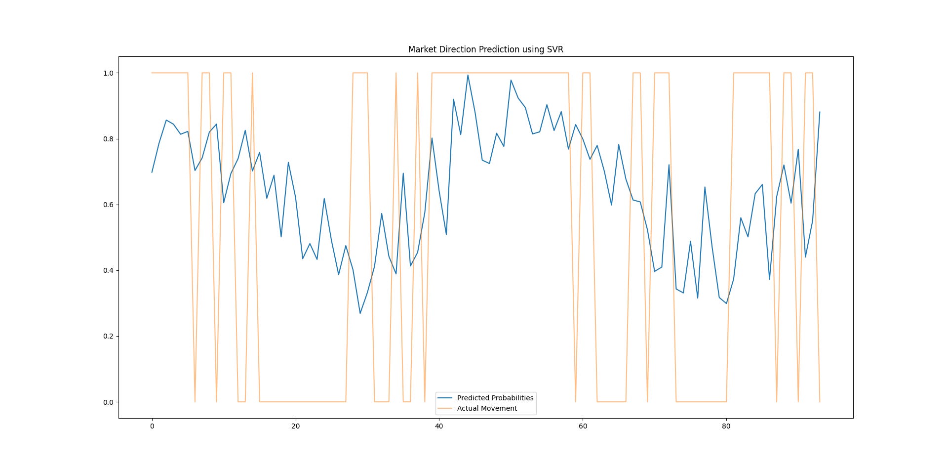
In the chart that visualizes predicted probabilities (from the regression model) versus actual market movements, we have two main elements to focus on:
Predicted Probabilities (blue line):
This line represents the model’s predictions about the probability of an upward movement in the market over the next 5 bars (as defined by our target variable). A value close to 1 indicates a higher likelihood of a price increase (up movement), while a value closer to 0 suggests a price decrease (down movement).
When the blue line spikes (near 1), it indicates that the model predicts a strong likelihood of upward movement.
When the blue line dips (near 0), it signals a strong likelihood of a downward movement.
Actual Market Movement (orange line):
This line shows the actual market movement, where 1 represents an upward movement (i.e., the price increased over the next 5 bars) and 0 represents a downward movement (i.e., the price decreased).
If the orange line is at 1, it means the price actually went up, and the model should have predicted this as well.
If the orange line is at 0, it means the price went down, and the model should have predicted this as well.
When the blue line (predicted probabilities) closely follows the orange line (actual market movements), it indicates that the model is performing well. It suggests that the model can effectively capture market movements and predict the direction:
False positives: If the blue line indicates a strong likelihood of upward movement (spikes near 1), but the orange line shows a downward movement (value of 0), this is a false positive.
False negatives: Conversely, if the blue line predicts a downward movement (value near 0), but the orange line shows an upward movement (value of 1), this is a false negative.
Higher correlation between the two lines means better prediction performance. Larger discrepancies suggest areas where the model might need improvement (e.g., better feature engineering, adding additional technical indicators.
# Calculate Pearson correlation between predicted probabilities (blue line) and actual market movements (orange line)
correlation = np.corrcoef(y_pred_prob, y_test)[0, 1]

print(f"Correlation between predicted probabilities and actual market movements: {correlation:.4f}")
The output shows around 0.28 of positive correlation.


