
A New Volatility Trading Strategy — Full Guide in Python.
Creating a Simple Volatility Indicator in Python & Back-testing a Mean-Reversion Strategy.

Trading is a combination of four things, research, implementation, risk management, and post-trade evaluation. The bulk of what we spend our time doing is the first two, meaning that we spend the vast majority of the time searching for a profitable strategy and implementing it (i.e. trading). This article deals with a risk indicator that can also be used to give out trading signals.
I have just published a new book after the success of my previous one “New Technical Indicators nin Python”. It features a more complete description and addition of structured trading strategies with a GitHub page dedicated to the continuously updated code. If you feel that this interests you, feel free to visit the below link, or if you prefer to buy the PDF version, you could contact me on LinkedIn.
The Book of Trading Strategies
Amazon.com: The Book of Trading Strategies: 9798532885707: Kaabar, Sofien: Bookswww.amazon.com
Introduction to Volatility
To understand the Pure Pupil Volatility, we must first understand the concept of Volatility. It is a key concept in finance, whoever masters it holds a tremendous edge in the markets.
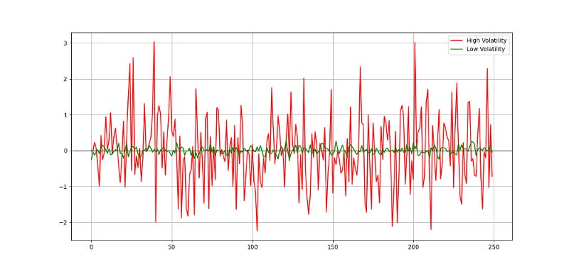
Unfortunately, we cannot always measure and predict it with accuracy. Even though the concept is more important in options trading, we need it pretty much everywhere else. Traders cannot trade without volatility nor manage their positions and risk. Quantitative analysts and risk managers require volatility to be able to do their work. Before we discuss the different types of volatility, why not look at a graph that sums up the concept? Check out the below image to get you started.
You can code the above in Python yourself using the following snippet:
# Importing the necessary libraries
import numpy as np
import matplotlib.pyplot as plt
# Creating high volatility noise
hv_noise = np.random.normal(0, 1, 250)# Creating low volatility noise
lv_noise = np.random.normal(0, 0.1, 250)# Plotting
plt.plot(hv_noise, color = 'red', linewidth = 1.5, label = 'High Volatility')
plt.plot(lv_noise, color = 'green', linewidth = 1.5, label = 'Low Volatility')plt.axhline(y = 0, color = 'black', linewidth = 1)plt.grid()
plt.legend()The different types of volatility around us can be summed up in the following:
Historical volatility: It is the realized volatility over a certain period of time. Even though it is backward looking, historical volatility is used more often than not as an expectation of future volatility. One example of a historical measure is the standard deviation, which we will see later. Another example is the Pure Pupil Volatility, the protagonist of this article.
Implied volatility: In its simplest definition, implied volatility is the measure that when inputed into the Black-Scholes equation, gives out the option’s market price. It is considered as the expected future actual volatility by market participants. It has one time scale, the option’s expiration.
Forward volatility: It is the volatility over a specific period in the future.
Actual volatility: It is the amount of volatility at any given time. Also known as local volatility, this measure is hard to calculate and has no time scale.
The most basic type of volatility is our old friend “the Standard Deviation”. It is one of the pillars of descriptive statistics and an important element in some technical indicators (such as the Bollinger Bands). But first let us define what variance is before we find Standard Deviation:
Variance is the squared deviations from the mean (a dispersion measure), we take the square deviations so as to force the distance from the mean to be non-negative, finally we take the square root to make the measure have the same units as the mean, in a way we are comparing apples to apples (mean to standard deviation standard deviation). Variance is calculated through this formula:

Following our logic, standard deviation is therefore:

Therefore, if we want to understand the concept in layman’s terms, we can say that Standard Deviation is the average distance away from the mean that we expect to find when we analyze the different components of the time series.
Creating the Pure Pupil Volatility Indicator
The Pure Pupil Volatility Indicator — PPVI — is a simple indicator that uses standard deviation as the main metric of fluctuations but tries to to exploit the most of the available data. It is generally to be used with a rolling window of 3. The above are the steps needed to create the indicator:
Calculate a rolling 3-period standard deviation on the Highs.
Calculate a rolling 3-period standard deviation on the Lows.
Calculate the rolling 3-period maximum values on the results from step 1.
Calculate the rolling 3-period maximum values on the results from step 2.
The PPVI will therefore be a two lines indicator where one deals with the upside volatility and the other with downside volatility. As we can see from the below plot, the lines are correlated but not quite the same as they assume that volatility is not the same when the market is going up or down.

Obviously, in blue the line dealing with the Highs volatility and the red line is the one dealing with the Lows volatility. To create the indicator, we need to have an OHLC data in the form of an array and then use the following syntax.
def adder(Data, times):

    for i in range(1, times + 1):

        new = np.zeros((len(Data), 1), dtype = float)
        Data = np.append(Data, new, axis = 1)
return Datadef deleter(Data, index, times):
for i in range(1, times + 1):
Data = np.delete(Data, index, axis = 1) return Data
def jump(Data, jump):
Data = Data[jump:, ]
return Datadef volatility(Data, lookback, what, where):
# Adding an extra column
Data = adder(Data, 1)
for i in range(len(Data)):
try:
Data[i, where] = (Data[i - lookback + 1:i + 1, what].std())
except IndexError:
pass
# Cleaning
Data = jump(Data, lookback)
return Datadef ma(Data, lookback, close, where):
Data = adder(Data, 1)
for i in range(len(Data)):
try:
Data[i, where] = (Data[i - lookback + 1:i + 1, close].mean())
except IndexError:
pass
# Cleaning
Data = jump(Data, lookback)
return Datadef pure_pupil(Data, lookback, high, low, where):
Data = volatility(Data, lookback, high, where)
Data = volatility(Data, lookback, low, where + 1)
for i in range(len(Data)):
try:
Data[i, where + 2] = max(Data[i - lookback + 1:i + 1, where])
except ValueError:
pass
for i in range(len(Data)):
try:
Data[i, where + 3] = max(Data[i - lookback + 1:i + 1, where + 1])
except ValueError:
pass
Data = deleter(Data, where, 2)
return Data
The indicator can be used for risk management or as a part of a trading strategy as we will see in the next section. Using it in risk management can be to set stops and profits by using the blue line as a stop for short orders and the red line as a stop for long orders. This is a way of volatility optimization.
The Pure Pupil Volatility Bands Strategy
A famous indicator under the name of Bollinger Bands has opened the path for other similar indicators like Keltner Channel and the Pure Pupil Bands which are heavily inspired by them. Simply put, we will follow these steps to create the Pure Pupil Bands, a volatility indicator to be used in the same way as the Bollinger Bands:
Calculate a 3-period simple moving average on the market price.
Add the result from step 1 to the PPVI high values multiplied by 2.
Subtract the result from step 1 to the PPVI low values multiplied by 2.
Now, we should have bands that envelop prices just like the Bollinger Bands do.
def pure_pupil_bands(Data, close, where):

    # Calculating a Simple Moving Average
    Data = ma(Data, lookback, close, where)

    # Upper Pure Pupil Band
    Data[:, where + 1] = Data[:, where] + (2 * Data[:, 4])

    # Lower Pure Pupil Band
    Data[:, where + 2] = Data[:, where] - (2 * Data[:, 5])

    # Cleaning
    Data = deleter(Data, 4, 3)

    return Data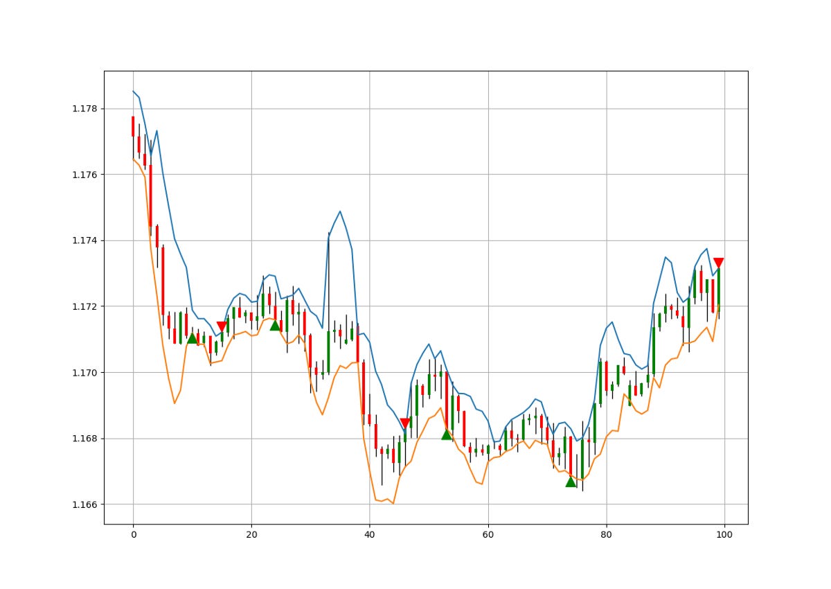
The conditions for the trade are rather simple:
Long (Buy) whenever the market closes at or below the lower Band.
Short (Sell) whenever the market closes at or above the upper Band.
To create the signal function above, we can use the below syntax.
def signal(Data, close, upper_band, lower_band, buy, sell):

    for i in range(len(Data)):

        if Data[i, close] < Data[i, lower_band] and Data[i - 1, close] > Data[i - 1, lower_band]:

            Data[i, buy] = 1

        if  Data[i, close] > Data[i, upper_band] and Data[i - 1, close] < Data[i - 1, upper_band]:

            Data[i, sell] = -1

    return Data
To create the visual signal chart, we can use the following function.
def ohlc_plot_candles(Data, window):

    Chosen = Data[-window:, ]

    for i in range(len(Chosen)):

        plt.vlines(x = i, ymin = Chosen[i, 2], ymax = Chosen[i, 1], color = 'black', linewidth = 1)

        if Chosen[i, 3] > Chosen[i, 0]:
            color_chosen = 'green'
            plt.vlines(x = i, ymin = Chosen[i, 0], ymax = Chosen[i, 3], color = color_chosen, linewidth = 3)
if Chosen[i, 3] < Chosen[i, 0]:
color_chosen = 'red'
plt.vlines(x = i, ymin = Chosen[i, 3], ymax = Chosen[i, 0], color = color_chosen, linewidth = 3)
if Chosen[i, 3] == Chosen[i, 0]:
color_chosen = 'black'
plt.vlines(x = i, ymin = Chosen[i, 3], ymax = Chosen[i, 0] + 0.00001, color = color_chosen, linewidth = 6)
plt.grid()def signal_chart(Data, close, what_bull, what_bear, window = 500):
Plottable = Data[-window:, ]
fig, ax = plt.subplots(figsize = (10, 5))
ohlc_plot_candles(Data, window)for i in range(len(Plottable)):
if Plottable[i, what_bull] == 1:
x = i
y = Plottable[i, close]
ax.annotate(' ', xy = (x, y),
arrowprops = dict(width = 9, headlength = 11, headwidth = 11, facecolor = 'green', color = 'green'))
elif Plottable[i, what_bear] == -1:
x = i
y = Plottable[i, close]
ax.annotate(' ', xy = (x, y),
arrowprops = dict(width = 9, headlength = -11, headwidth = -11, facecolor = 'red', color = 'red'))signal_chart(my_data, 3, 6, 7, window = 100)
plt.plot(my_data[-100:, 4])
plt.plot(my_data[-100:, 5])
If you are also interested by more technical indicators and using Python to create strategies, then my best-selling book on Technical Indicators may interest you:
New Technical Indicators in Python
Amazon.com: New Technical Indicators in Python: 9798711128861: Kaabar, Mr Sofien: Bookswww.amazon.com
Evaluating the Strategy
Having had the signals, we now know when the algorithm would have placed its buy and sell orders, meaning, that we have an approximate replica of the past where can can control our decisions with no hindsight bias. We have to simulate how the strategy would have done given our conditions. This means that we need to calculate the returns and analyze the performance metrics. Let us see a neutral metric that can give us somewhat a clue on the predictability of the indicator or the strategy. For this study, we will use the Signal Quality metric.
The signal quality is a metric that resembles a fixed holding period strategy. It is simply the reaction of the market after a specified time period following the signal. Generally, when trading, we tend to use a variable period where we open the positions and close out when we get a signal on the other direction or when we get stopped out (either positively or negatively).
Sometimes, we close out at random time periods. Therefore, the signal quality is a very simple measure that assumes a fixed holding period and then checks the market level at that time point to compare it with the entry level. In other words, it measures market timing by checking the reaction of the market after a specified time period.
# Choosing a Holding Period for a trend-following strategy
period = 2
def signal_quality(Data, closing, buy, sell, period, where):
Data = adder(Data, 1)
for i in range(len(Data)):
try:
if Data[i, buy] == 1:
Data[i + period, where] = Data[i + period, closing] - Data[i, closing]
if Data[i, sell] == -1:
Data[i + period, where] = Data[i, closing] - Data[i + period, closing]
except IndexError:
pass
return Data# Applying the Signal Quality Function
my_data = signal_quality(my_data, 3, 6, 7, period, 8)positives = my_data[my_data[:, 8] > 0]
negatives = my_data[my_data[:, 8] < 0]# Calculating Signal Quality
signal_quality = len(positives) / (len(negatives) + len(positives))print('Signal Quality = ', round(signal_quality * 100, 2), '%')
# Output Signal Quality EURUSD = 56.61
# Output Signal Quality USDCHF = 54.13%
# Output Signal Quality AUDCAD = 54.94%A signal quality of 56.61% means that on 100 trades, we tend to see a profitable result in 56 of the cases without taking into account transaction costs.
Conclusion
Remember to always do your back-tests. You should always believe that other people are wrong. My indicators and style of trading may work for me but maybe not for you.
I am a firm believer of not spoon-feeding. I have learnt by doing and not by copying. You should get the idea, the function, the intuition, the conditions of the strategy, and then elaborate (an even better) one yourself so that you back-test and improve it before deciding to take it live or to eliminate it. My choice of not providing Back-testing results should lead the reader to explore more herself the strategy and work on it more.
To sum up, are the strategies I provide realistic? Yes, but only by optimizing the environment (robust algorithm, low costs, honest broker, proper risk management, and order management). Are the strategies provided only for the sole use of trading? No, it is to stimulate brainstorming and getting more trading ideas as we are all sick of hearing about an oversold RSI as a reason to go short or a resistance being surpassed as a reason to go long. I am trying to introduce a new field called Objective Technical Analysis where we use hard data to judge our techniques rather than rely on outdated classical methods.